

by Nathan Brown
January 13, 2015
Nathan Brown is an artist/designer from Austin Texas. He specializes in web design, poster design, and album cover art -- and has a particular affinity for grunge and retro design styles.

A Step by Step Guide to Designing an Indie Film Poster
Let's Go To The Movies
I've always been a fan of film poster design. I think it's the whole idea of creating a story from a single image. Taking just a piece of a film and, telling enough about that film with one design, to entice the audience to see more is a challenge for a designer. But it's a fun challenge to explore. In this tutorial I'm going to walk through my process and methods for creating a mock indie film poster.
Here's a full look at what we'll be creating: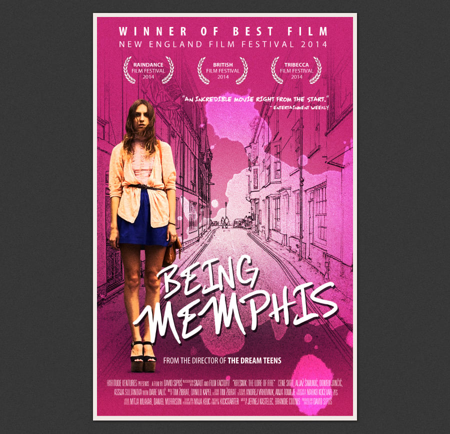
Step 1 - Predesign Initial Steps
First up, I want to take the film and subject matter into consideration. Since this is a mock film, we'll be making everything up. For a title I chose "Being Memphis". I thought that had a nice "indie film" ring to it. The subject matter is a young girl in a coming of age type story. That's all I think we need to know for this one since it's just for a design exercise.
Next up, I want to do a mood board containing elements of inspiration for our poster design. It can include everything from photos, illustrations, colors, other film posters, film screen shots, logos and graphics, etc… Below is my mood board for this design.
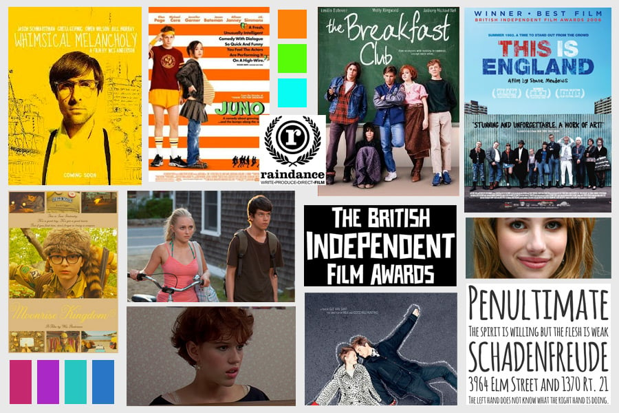
Again, your mood board can contain anything you fill is inspiring and will help you in creating the right mind set for this design.
Step 2 - Initial Thumbnails and Roughs
Okay, so I know this film needs the right "indie" look, it's about a girl coming of age, and it's called "Being Memphis". I've seen enough indie movies that some ideas spring to mind right away. Below are some thumbnail sketches that I made exploring some general ideas.

It's good practice to keep your thumbnails loose and quick. The ideas is to explore as many ideas as quickly as possible. It's amazing how fast you can see what might work and what definitely will not. I did a lot more than three, but I decided these were the most solid. The middle one is my favorite, and the one I'll be fleshing out in the next step.
Step 3 - Gather Materials
I now have a general idea of what I want to create. If this were a real project, some of these materials would be coming from the studio or film makers. Things like actor photos, scene shots, credits, quotes, etc… But since this isn't real, will be doing some casting selection of our own.
After a bit of exploring I found a photo which I think will work out perfectly. You can download the photo here: http://www.freeimages.com/photo/1441660

I also wanted a good shot of a city street to place the girl in. I found this photo over at Unsplash.com. It should work perfectly.

Step 4 - Initial Layout
Let's create a new document in Photoshop. I made mine 11x17 at 300dpi. Real movie posters are larger, but for our purposes, this is big enough.
As the first step in the layout process, we'll need to remove the girl from the brick wall background. I used the Quick Mask Mode in Photoshop, and painted the selection over the girl. Of course, you can use whatever selection method you prefer.

Now you can simply copy and paste the girl into a layer on the poster file. I moved her to the side a bit, to eventually make room for the title.

Let's drop a color fill layer in for the background. I chose a pink color (#c73085).

I want the girl to have a bit more contrast and film grain. To add some contrast, duplicate the girl layer, set her blend mode to "Multiply" and reduce the layer's opacity to 50%. Now back on the original layer, apply a film grain effect by clicking Filter | Artistic | Film Grain. Adjust the settings so that the photo has a touch of grain without overdoing it. Now the girl should have more of a printed grainy look.

Next up, let's add the city street scene into the background. I want the background to have an illustrated or outlined look versus an actual photo. To achieve this, switch over the the street photo file. Duplicate the background layer, and convert it to black and white (Cmd+Shift+ U).

Now duplicate that layer and invert it (Cmd+I). Then chance it's blend mode to "Color Dodge". The document will turn to mostly white. Now click Filter | Other | Minimum and use a setting around 1 or 2 to convert the photo to an illustration.

Select all of the layers on the Layers Panel and press (Cmd+E) to merge them. Now select the entire image and copy and paste it back over in the poster file. Move the new layer below the girl layers and chance it's blend mode to "Multiply" so that the pink background will show through.

Step 5 - Title Treatment
For the title, I knew I wanted to do something hand written. There's lots of great hand written fonts out there, or you can always letter your own title. For this design, I really like the 80s-esque look of a font called Mizike. You can download this free font here: http://www.dafont.com/mizike.font
I placed the title near the bottom slightly overlapping the girl. I also added a slight drop shadow, by just copping the font layer, switching it to a dark gray and nudging it a few pixels down and to the right.

Step 6 - Adding Type
One thing most film posters have in common is text, and sometimes there's lots of it. It usually consists of the main title, actors names and film maker credits at a minimum. But it can also include tag lines, reviewer quotes, awards and more. For our poster we'll be adding a few of these. The trick is to add in the type without distracting from the main title and subject. It's a fine line, but if you consider how the eye reads from left to right and top to bottom, a balance can be easily achieved.
Let's start with the awards listed at the top. I chose a Myriad Pro (which you should already have if you own Photoshop). Any clean sans serif font will work as long as it as various weights available. The top line is bold condensed and the bottom is regular. I adjusted the kerning to space out over the top of the poster. This thins the visual line a bit, so that the eye sees it, but doesn't necessarily focus on it at first glance.

Next up, I added some fake awards. Again, these are spaced evenly across the top, not too big to distract the eye, but big enough to be read well.

Now, there's a bit of an issue with the background interfering with the readability of the type. To solve this problem, I added a simple gradient using the background pink color to transparent below the type layers but above the background illustration.

To finish up the top half, I added a reviewer quote. So that it stands out from the awards, I used the Mizike font used in the title. The top half of the poster has a nice balanced feel to it that should hold up well against the main title and credit fonts will be adding to the bottom half.

Step 7 - Adding More Type
Let's add some type to the bottom of the poster. The bottom usually consists of film maker credits and studio logos in a small ultra condensed font. The reason for that is because it's typically a lot of text to fit into a tight space, and you don't want the credits to distract the eye. A great font to use for credits is SF Movie Poster, which can be downloaded here: http://www.dafont.com/sf-movie-poster.font
I used filler text for my credits. You can type whatever you like to fill this space. One tip for movie credits is the use of bold and regular weights. Typically the person's name is bold and the attribute is regular weight, or thin.

There's a bit of space below the main title above the credits that I'd live to fill with one last bit of type. I added a note about the director here.

We run into the same issue with the background interfering with the credits, so I added another pink to transparent gradient below the credits.

Step 8 - Shading and Highlights
Now let's add just a bit of shading and highlights by creating a two new layers below the illustration background layer. On the first layer use a large soft black brush to paint a large area of shadow, reduce this layer's opacity to around 30-50% depending on preference. This shadow will help draw the eye to the main title.

On the second layer, above the shadow layer, use a large soft white brush to paint a highlight area. Reduce this layers opacity to around 50%.

Step 9 - Final Effects
Let's add a few finishing effects. First up, I want the whole poster to have a little bit more grain to it. I'll do this by adding a new layer above the background illustration and the pink gradients at the top and bottom. I want to fill it with gray by clicking Edit | Fill and choosing 50% Gray. Now apply a grain to this layer by clicking Filter | Noise | Add Noise. Choose and amount that is subtle. Now change this layers blend mode to "Overlay"

Next, let's throw some paint on it… Wait, what? I wanted to add a spill or a splatter to add to the story a bit in a subtle or abstract way. This girl looks a bit awkward, or maybe her life is a mess, or somethings not perfect… Either way, this splatter adds a little bit to the story.
I chose a coffee stain brush from this set here at MediaLoot (Coffee Stains - Brushes & Vectors). I also set the layer's blend mode to "Overlay" so that the background would show through.

Step 10 - Finishing up
To finish this one up, I added a subtle Gradient Map adjustment layer above all other layers. This helps to balance the colors a bit. I set this adjustment layer's opacity to 30%.

And that's it! Here's a look at the final piece with a white border added. Coming to a theater or film festival near you ;-)
I'd love to see your movie poster designs. Post some links to your work using the comment fields below.


Comments