
by Nathan Brown
February 10, 2015
Nathan Brown is an artist/designer from Austin Texas. He specializes in web design, poster design, and album cover art -- and has a particular affinity for grunge and retro design styles.


A Step-by-Step Guide for Creating an Outdoor Themed Vector Badge
Badges, Banners, and Bears, Oh My!
Without a doubt, drawing graphics by hand is my preferred method of attack. I'm a fan of the slightly imperfect line made by the human hand versus the perfect line made by a vector drawing program. But, you can combine the two to create a powerful work flow. Let's take a look at my process for creating an outdoor themed vector badge.
Step 1 - Thumbnail and Concept
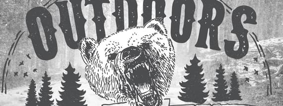
I already have a general idea in my head of what I want this badge to look like. I want it to be a half circle, include a bear and some trees, a banner and the text "The Great Outdoors". I sketch a quick thumbnail to see how these items might fit together.

Note: This is quick and rough to see how the elements might fit together. Also… I don't plan on the bear looking this sweet and cuddly in the end. :-)
Step 2 - Drawing Initial Elements
For the bear, I found some quick reference photos from a Google image search.

With pencil and paper, I begin to lightly sketch the bear. This is pretty fast using light strokes to get the overall shape right.

Next, I take a pen and begin inking all of the details. I like to use Micron Pens to ink my illustrations. They make a nice smooth black line, and come in a variety of sizes.

Here's a look at the final inked bear with a pen in the shot for size reference.

I drew the other elements (including trees, a banner and various lines/ornaments) using the same method.
Step 3 - Scanning and Combining Elements in Photoshop and Illustrator
I scan each element into Photoshop and desaturate the scan using Image | Adjust | Desaturate. Then I'll adjust the Levels to bring out the blacks a bit more using Image | Adjust | Levels.

Then I'll copy and paste the bear into a new document in Illustrator. Select it, and choose Object | Live Trace | Tracing Options and use settings similar to mine. Once traced, choose Object | Expand. This turns our illustration into a vector shape. I repeat this process for all of my illustrated objects.

Step 4 - Assembling the Badge and Finishing Up
Now that I have all of my hand drawn objects converted to vectors, I can begin assembling the badge design.

Below is the overall shape from our thumbnail image. I copied and flipped the outer border using Object | Transform | Reflect

I chose a free font from WeGraphics.net titled Wild Spaces for the title. I applied a slight arc using Effect | Warp | Arc. Then I converted the letters to shapes using Object | Expand. Once ungrouped, I made the outer most letters slightly larger and tightened the space among all letters to fit within our border shape.

At this point I want to do a little clean up. First up, I used the eraser tool to remove some of the border lines that overlap the letters. Then I used a white Blob Brush (Shift+B) to create a background shape for the bears head. I then select the shape and the bear drawing and bring them to the front using Object | Arrange | Bring to Front. This essentially knocks out part of the banner and the letters.

Next I placed the trees and the birds… I like the way it's coming together so far!

For the secondary font I chose another one from WeGraphics titled Fitzsimmons. The "Since 1935" is tilted a little bit, and is outlined with some lines I hand drew and scanned.

The banner font is one more from WeGraphics called Despiser I rotated and warped the text slightly to align it with the banner.

Step 5 - Adding a Background Image
As a final step, I copied and pasted the badge back into Photoshop. I grabbed an amazing image from among all of the amazing images at Unsplash and applied it to the background. I desaturated the image, and overlaid a subtle grunge texture. On a layer below the badge, I used a large soft white brush to hide a little bit of the background photo so that it wouldn't be to distracting showing through the badge.

Share your results!
If you've followed along with this tutorial or even used it as a starting point, share your own results in the comments below. Just link to your creation in your comment message.


Comments