
by Tony Thomas
March 14, 2018
Tony creates pixel-perfect UI kits & icons. His pug, Wednesday, is Medialoot's beloved mascot.
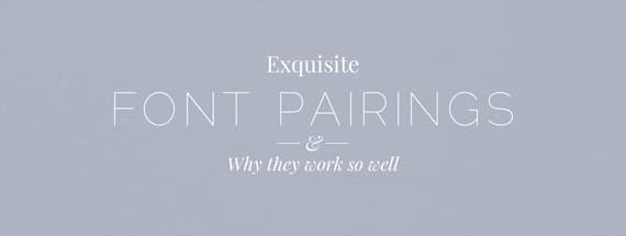
10 Exquisite Font Pairings and Why They Work so Well
Perfect Pair
With so many different fonts out there to choose from, sometimes getting the right combination to use in your project can be a tricky task. This round-up uses 10 visual examples of exquisite font pairings and explains what it is that makes them work so well together.
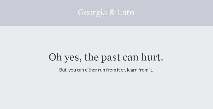
Georgia & Lato
Serif fonts and humanist sans-serif are nearly always a great combo. The distinction between serif and sans-serif provides contrast, where as the humanist elements of the sans-serif bring them together. Georgia and Lato in particular compliment each other due to their similar width, and medium x-heights.
I recommend using Georgia as a heading and Lato for body text. Georgia has beautiful letterforms that can appreciated at larger sizes, and Lato has good readability for body text. That being said, they work great either way!
Where to download?
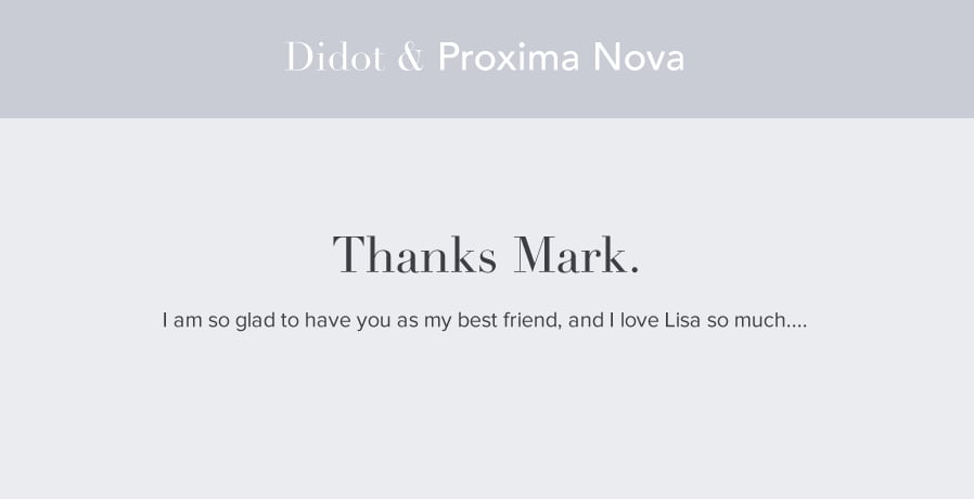
Didot & Proxima Nova
The old-style serif of Didot and the modern geometric sans-serif Proxima Nova provide a very strong contrast. When used together, Didot appears much more modern than when viewed in isolation. This a great way to integrate elegance and character into a design whilst maintaining a modern image.
Didot doesn't have great readability at small sizes due to it's varying stroke widths, however it looks fantastic for headers. Proxima Nova works well for body copy.
Where to download?
- Didot ($99)
- Proxima Nova (Typekit)

Source Sans Pro & Source Serif Pro
The easiest way to guarantee a harmonious font pair is to look for font super families. A font super family is a collection of two or more font families that are designed to work together, usually by the same foundry.
Font super families will often have very similar letterforms, the same x-heights and matching kerning. A prime example of this is Source Sans and Source Serif:
Where to download?
- Source Sans Pro (Free)
- Source Serif Pro (Free)

Avenir & Baskerville
Much like Didot and Proxima Nova, this combination marries an old-style serif with a modern geometric sans-serif. The contrast between styles with Avenir and Baskerville is what makes this combination work so well.
Unlike the previous example with Didot, Baskerville has excellent readability at smaller sizes which makes it perfect for body copy. Avenir also makes a fantastic headline font.
Where to download?
- Avenir (From $35)
- Baskerville (From $35)
- Libre Baskerville (Free Alternative)
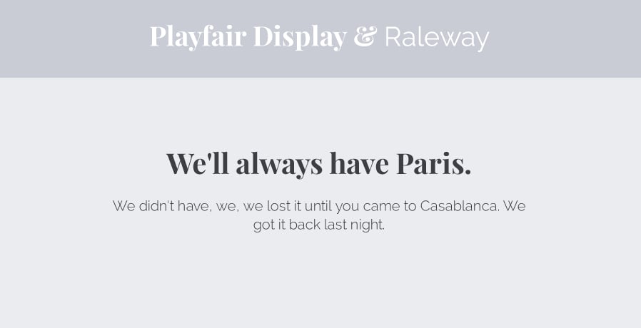
Playfair Display & Raleway
Here we have two modern fonts with very complimentary aesthetics. Although Playfair is a display serif and Raleway is an ultra-thin sans-serif, they share similar letterforms and relatively tall x-heights. But what really unites these two fonts is how the ultra-thin strokes of Raleway are picked up by Playfair in the joining elements of it's letterforms.
Playfair has poor readability at small sizes due to it's varying stroke widths, which makes it more suitable for headlines. Raleway looks pretty good at any size, but in this example it makes sense to use it for body copy.
Where to download?
- Playfair Display (Free)
- Raleway (Free)

Museo Slab & Museo Sans
Another font super family, Museo Slab and Museo Sans compliment each other perfectly. Just like most font super families they have matching widths, x-heights, kerning and letterforms.
The slab serif styling of Museo Slab technically makes it a display font more suitable for headlines than body copy. Museo sans has good readability at smaller sizes.
Where to download?
- Museo Slab (Free)
- Museo Sans (Free-$89)

Helvetica Neue & Adelle
Helvetica Neue and Adelle are a slightly less obvious choice for a font pairing. But because almost anything goes well with Helvetica, it's okay to think a little more outside of the box with this one. The slab serif of Adelle provides contrast, and is a little more interesting than a traditional (non-slab) serif font choice.
Both of these font's have excellent readability at small sizes. Helvetica is very widely used as body copy, and for good reason. But if you want to shake things up a bit, try using Helvetica for the headline and Adelle for the body copy instead.
Where to download?
- Helvetica Neue (Mac System Font)
- Arial (Windows System Font)
- Adelle (From $49)
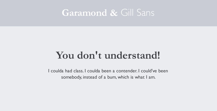
Garamond & Gill Sans
Garamond and Gill Sans are a classic font pairing. The old style serifs of Garamond compliment the more modern sans-serif Gill sans. Both fonts share humanist elements, and there are similarities in the styling, take a look at the uppercase G, and lowercase a for example.
The width of these fonts is similar, and they both have medium sized x-heights. Although Gill Sans is naturally a larger font, adjusting the font size makes this a non-issue. Garamond and Gill Sans is a font pairing which can be alternated to have either as the header or body font.
Where to download?
- Adobe Garamond (TypeKit)
- EB Garamond (Free Alternative)
- Gill Sans ($199)

Oswald & Roboto
Oswald and Roboto share condensed letterforms and relatively high x-heights, which make them a good match. Despite Roboto being a relatively narrow font, it looks wide and very readable by comparison to Oswald.
Oswald is designed for impact, which makes it the clear choice for headline font. The humanist elements of Roboto help it's readability at smaller sizes, making it a good fit for body copy.
Where to download?

Montserrat Bold & Montserrat Light
Finally, sometimes it isn't necessary to look very far for the perfect compliment to a typeface. In the example of Montserrat, you have 8 different weights ranging from Black all the way down to Hairline which despite being the same family, offer extreme contrast. A slightly more subtle amount of contrast would be between Bold and Light.
The width, x-height, kerning and whitespace are identical which makes them a perfect match, and the weight difference provides the required contrast between heading and body copy.
Where to download?
- Montserrat (Free)


Comments