How to Create an Ink Stamp Text Effect with Illustrator CS6
Grungy vector goodness for your type
This tutorial for Illustrator CS6 will teach you how to achieve an ink stamp style text effect by layering multiple fills and effects. And this effect can also be applied to vector shapes if you prefer.
Step 1
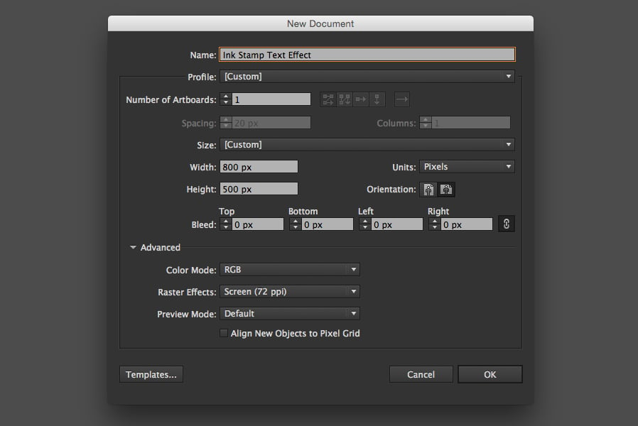
Open Illustrator CS6 (or newer) and create a new blank RGB document, W: 800 px H: 500 px.
Step 2
For this effect we will need to create two custom pattern swatches in Illustrator. I recommend downloading our pre-made vector speckle textures to get you started. Alternatively you can skip this step and download the result for free here
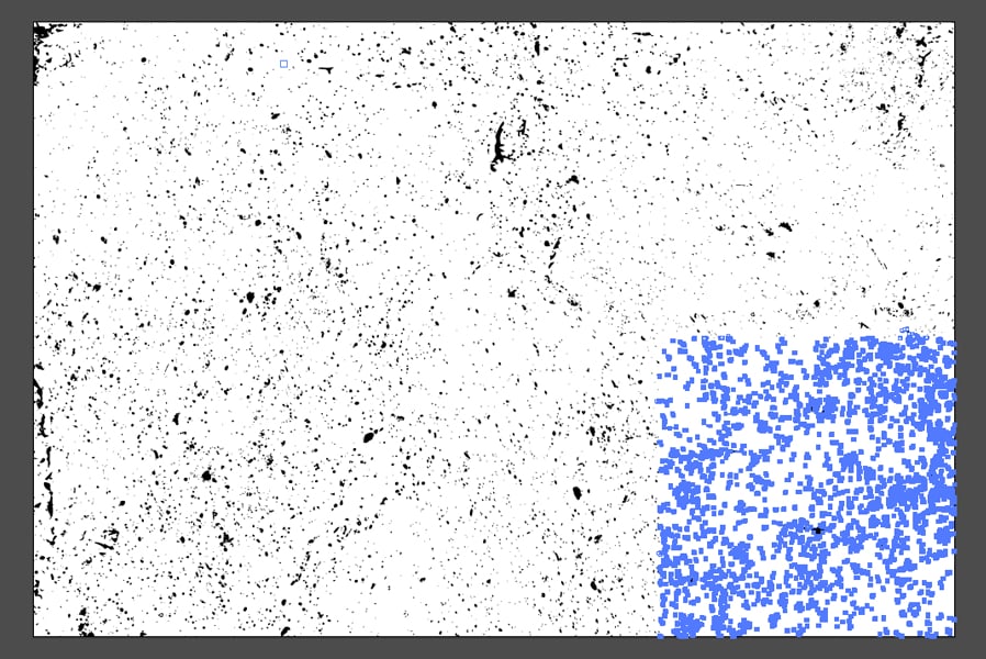
When you have your vector grunge texture ready in Illustrator, use the Direct Selection tool to grab the section of the texture you want to use (aim to make your selection roughly a square).
Copy and paste your selection into the blank document we created in step 1, and set the dimensions to W: 150px H: 150px and use the Unite function in the Pathfinder window to merge it.
Step 3
We now want an inverted version of this texture, so draw a black square W: 150px H: 150px, then duplicate the texture and place it directly on top of the square with the fill set to white.
Step 4
Select the texture with the black background and go the Object > Pattern menu and click Make to create our first pattern swatch. Set the Tile Type to Brick by Column to mix up the pattern a little.
Step 5
Select the black texture with no background and go the Object > Pattern menu and click Make to create our second pattern swatch. Again, set the Tile Type to Brick by Column.
Step 6
Now use the Type Tool to place your word in the center of the document. Use the font nevis Bold and font size 188 pt. If needed, correct any tracking/kerning issues.
Step 7
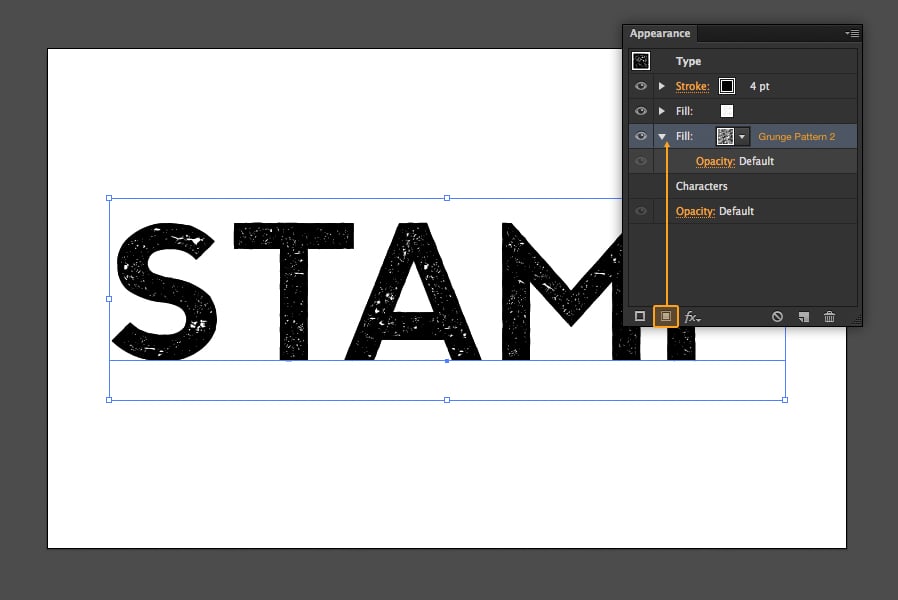
In the Appearance panel set the Fill to the first grunge pattern swatch.
Step 8
Add a Roughen filter from the Effect > Distort and Transform menu with size 1px Absolute and detail 15/in.
Step 9
Increase the Stroke width from 0 to 4pt to add a black border.
Because the stroke is applied to text, the option to align to the inside isn't available. A workaround for this is to select the Stroke layer in the Appearance panel and add the Offset Path filter from the Effect > Path menu directly to it. The offset value should be half of whatever the stroke width is to align to the inside.
Step 10
Also add a Roughen filter to the stroke, with size 1px Absolute and detail 15/in.
Step 11
One of the best things about Illustrator is that you can have multiple fills and strokes. Let's take advantage of this to add some extra grunge detail around the text. Click the Add New Fill button in the Appearance panel and set the fill to the second grunge pattern.
Step 12
We can't currently see the second fill because it is behind the other fill and stroke. However we can use the Offset Path filter again to increase the size of only the second fill by 4 pixels.
Step 13
To make the outer grunge look a bit more natural, we can also Roughen the path with size 15px Absolute and detail 15/in.
Step 14
In this step we will be vectorizing the type layer, which means it will no longer be editable. You will probably want to create a copy of the text layer at this point, just in case you want to go back and change the text later.
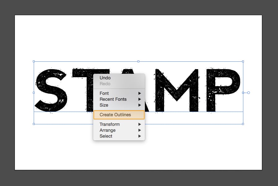
When you are happy to proceed, right click the type layer and click Create Outlines.
Step 15
Use the Direct Selection tool and hold down the Shift key while you highlight all of the external corners on your text. Increase the Corner Radius to 6 px.
Step 16
Now highlight all of the internal corners and increase the Corner Radius to 3 px.
Step 17
To merge all of these different fills, strokes, patterns and effects we will need to Rasterize our text (don't worry it makes sense in the next step).
Step 18
Using the Image Trace function to re-vectorize our text will flatten it, convert white fills to transaprent, and also roughen the text slightly. Use the options show in the image below to retain the most detail.
Result
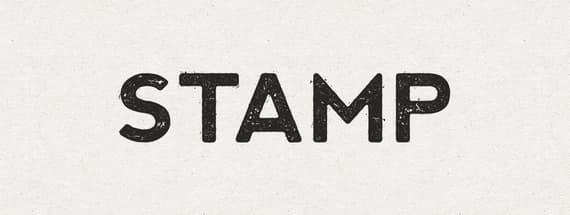
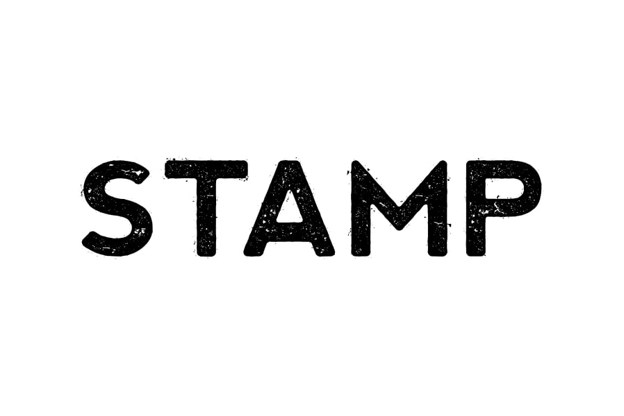
Here is the result of the ink stamp effect, I have added a subtle paper texture from this set behind the text and set the fill color to #282725 for some final touches.
Conclusion
Hopefully you have enjoyed following along with this tutorial, and learned some new techniques. Adding multiple strokes and fills with the Appearance panel, and applying effects to them can open up a whole new world of possibilities in Illustrator.















Comments