

by Tony Thomas
January 18, 2018
Tony creates pixel-perfect UI kits & icons. His pug, Wednesday, is Medialoot's beloved mascot.
Style Guides: A Design Mock-up for the Responsive Web (Updated)
Fixing responsive mock-ups
Most designers have traditionally followed a set process when creating websites, but now that we are in the world of responsive design, and websites that are accessed on more devices than ever before. Using Photoshop to create design mock-ups is increasingly becoming flawed.
It may vary slightly from project to project and from designer to designer, but the current process usually looks something like this:

This should look very familiar to a lot of designers. It is the way nearly all creative professionals have worked since the beginning of web design as an industry. But now that we are in the world of responsive design, and websites are accessed on more devices than ever before. Using Photoshop to create design mock-ups is increasingly becoming flawed.
One of the main concerns with using Photoshop or any other design tool to create mock-ups is that the end product is usually a collection of .psd files that need the styles extracting from them. And of course a static pixel-based layout.
Note: I'm mentioning Photoshop specifically throughout this article, but the same applies to other applications such as Sketch and Illustrator etc.
The problem with traditional mock-ups
The design mock-up is too static
A traditional web design mock-up is a set amount of pixels wide, 960 for example. And every line of text, button image and other elements are set in stone. Unlike on the web where these things will inevitably vary between devices, browsers and even the size of the browser window.
Too much time is spent on pixel pushing
Designers and clients get too caught up in making the design mock-up pixel-perfect. Spending an inordinate amount of time pushing elements a pixel here and there. Hard work which often times is unimportant anyway, because the position of elements changes when the design is finally translated into the browser.
Extracting styles is complicated
Whether you are coding up your own designs, or a developer coding somebody else's work. You need to look through your .psd files to find the right element and extract it's CSS properties. But what if you can't remember which page that element was on, or worse is on a page that hasn't been mocked up?
Designing in the browser (and why it doesn’t work)
Okay so using Photoshop is a waste of time and we should design directly in the browser instead right? Well, no. From my personal experience, this is also very unintuitive and limits creativity. Typing your design in code simply doesn’t work. Although you may create a perfectly nice looking result, your ability to try out different ideas and concepts quickly until you find the best way to present your ideas is greatly inhibited.
The benefits to designing in the browser are that it is flexible and responsive, and once you have finished your design you also have it ready to go in the correct medium. So it is something of a time-saver too, but is that really worth limiting your design process so drastically for?
What does work well?
Photoshop mock-ups are too detailed and static, designing in code is too limiting. But one thing that most designers (hopefully) already do on a regular basis is spot on:
Wireframes
Wireframing is a great way to plan a project, it is quick and extremely flexible. It can be done on paper, with the aid of software like OmniGraffle, or with tools you are already familiar with such as Photoshop and Illustrator.

A wireframe is not just a quick ideas sketch though, it can also serve as a blueprint for a design, much like an architect would hand over to the contractors when designing a building. With this wireframe/blueprint in place we are half way to having everything we need to starting building the design in code. The other half that’s missing is the styling, or ‘visual language’.
Defining the visual language
If we are happy to use wireframes to layout the structure of a web project, we need something else to go with them that defines the visual language of the project:
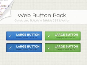
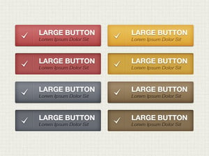
UI Style Guides
Introducing ‘UI Style Guides’. In the print industry something very similar to this already exists, usually referred to as ‘Branding Guidelines’ and they work. We can adapt this idea to also work for web and interface design.
Unlike branding guidelines, which focus on color schemes, and when and how to display a company logo. UI style guides will focus on the visual language, and interface elements. The best way to explain this is with some examples:


By combining wireframes and ui style guides, we can separate the visual language from the structure. Something which is often difficult for clients to do when they are presented with a complete mock-up. It becomes possible to make quick and easy changes to the layout without needing to worry about the styling. And likewise if the client wants to make changes to the visual language, it can be done without worrying about updating multiple elements across multiple pages.
How will the client react to this? Well, it’s hard to say at this early stage. But if you explain in initial meetings how you intend to present your ideas, and the benefits of working this way, as an alternative to traditional mock-ups. Then the client should understand what to expect, and hopefully appreciate it.
How to Create a Style Guide Template.
There is no one size fits all method for creating style guides. It will depend largely on your design and the elements that you are actually using. A good starting point is to include these basic elements which are featured in most web designs:
- Background Color or Pattern
- Primary and secondary colors
- H1-H6 and Paragraph styles
- Link styles
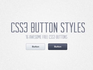
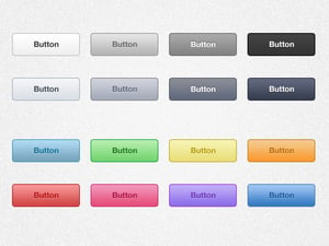
- Button styles including hover and active states
- Icons
- Form elements
We have created a UI Style Guide Template to get you started. Download it for free now and challenge your current workflow.
Extracting CSS from a Style Guide
As a developer the benefits of using this method may not be as obvious. But if you consider that you will now be working with 2 separate files, a wireframe and a style guide. The wireframe is going to make it much easier to isolate the structure of the design and dissect the columns and rows to build the underlying grid. The wireframe may also include variations for different viewports and breakpoints.
But what about the style guide? If it was made in Photoshop, Sketch or Illustrator you still need to slice the design right? Lot's of going back and forth to copy color values and measure elements, calculate margins and paddings. Well, it may not be as tricky as you think. Most major graphics applications now offer some kind of feature to allow you to automatically generate CSS styles elements.
Because Style Guides are by their very nature a more organised way of displaying the important visual elements of a design. What you actually have is a list of organised UI Elements, waiting for you to copy and paste the css styles from them into your code editor.

How to copy css styles from Photoshop
In Photoshop, show the Layers panel (Window > Layers) and select the layer that you want to copy styles from. Right click the layer and choose Copy CSS.
How to copy css styles from Illustrator
In Illustrator, show the Layers panel (Window > Layers) and CSS Properties panel (Window > CSS Properties). Select the object that you want to copy styles from and in the Layers panel, give the object a name. You should now be able to copy the styles from the CSS Properties panel.
How to copy css styles from Sketch
Select the object that you want to copy styles from, right click it and choose Copy CSS Attributes.
Working with complex CSS combinations
Unfortunately in the real world, it won't always be as simple as copying and pasting styles for every single individual element in the style guide. Although it would probably work, we know that this is not an efficient way to code a design. Here are some tips for converting a Style Guide into CSS:
Analyse the design and look for repeating elements
Perhaps a certain color, font size, border radius, amount of padding etc. is used multiple times throughout the style guide. Make note of these elements.
Use SASS or other preprocessor to create variables
One of my favourite things about preprocessors like SASS is that you can reuse values which appear multiple times. Photoshop won't tell you when you copy a button a style that it is the same color as the link text. But you know that it is. So what you can do is create a variable for that color. For example: $primary-color: #E8BA2D then if the primary color changes in the future, you can simply update the variable once.

Find and Replace duplicate values
Continue building your stylesheet by copying and pasting CSS stacks from the style guide, and then when you are done. You can use the Find & Replace feature which should be included with all good code editors to replace duplicate values with your SASS variables. For example replace all instances of #E8BA2D with $primary-color.
Conclusion
Since first writing this article in 2013, the web has come a long way. I still believe that this is the way forward for responsive web design. Especially with the rising popularity of HTML frameworks such as Bootstrap and CSS preprocessors like SASS, wireframes and style guides are more relevant than ever.
There are many different ways to approach style guides. But however you choose to do it, it will save you time and headaches in the long run.


Comments