

by Tony Thomas
April 11, 2017
Tony creates pixel-perfect UI kits & icons. His pug, Wednesday, is Medialoot's beloved mascot.
A Beginners Guide to CSS Grid Layout
Find out what CSS Grid Layout is, how it works and why it is going to make your life as a designer or developer easier with this accessible introduction to CSS Grid Layout. We will cover terminology, basic how-to's and an example layout to get you started with the new grid system.
What is CSS Grid Layout?
CSS Grid Layout is a grid system that can be used to define two-dimensional grid layouts on the web. This is the first time that CSS has had the ability to create such layouts and promises to simplify how designers and developers go about building both major page layouts and other minor interface elements.
Unlike previous methods for web layout (HTML tables and more recently CSS floats) CSS Grid Layout in a nutshell allows you to define a grid made up of columns and rows, and then instruct the browser where on this grid you want your HTML content to be displayed.. even if that means your content in a different order than it appears in the HTML structure.
CSS Grid Layout Terminology
Grid
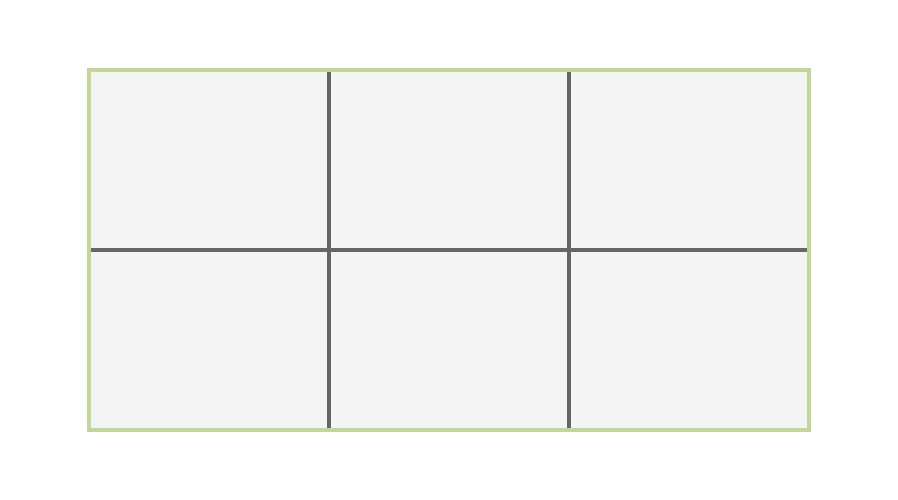
The grid is pretty self explanatory, it is the container element for the grids rows and columns. Grids can be nested within each other. But don't worry, unlike HTML tables most layouts should not require excessive nesting.
Grid Lines

Grid Lines are the dividing horizontal and vertical lines which make up the grid, they are referred to by number or can be given a name. Content cannot be placed within lines, instead they are used to reference cells, columns and rows.
Grid Column
A grid column is a vertical grid track, or the area between two vertical grid lines.
Grid Row

A grid row is a horizontal grid track, or the area between two horizontal grid lines).
Grid Cell

A grid cell is the intersection of a row and a column, defined as being the area between 4 grid lines.
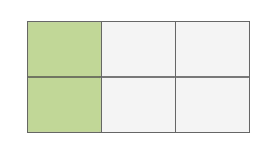
Grid Area

A grid area is an area on the grid between 4 grid lines, like a grid cell but can contain multiple grid cells that are next to each other.
Basic Functionality
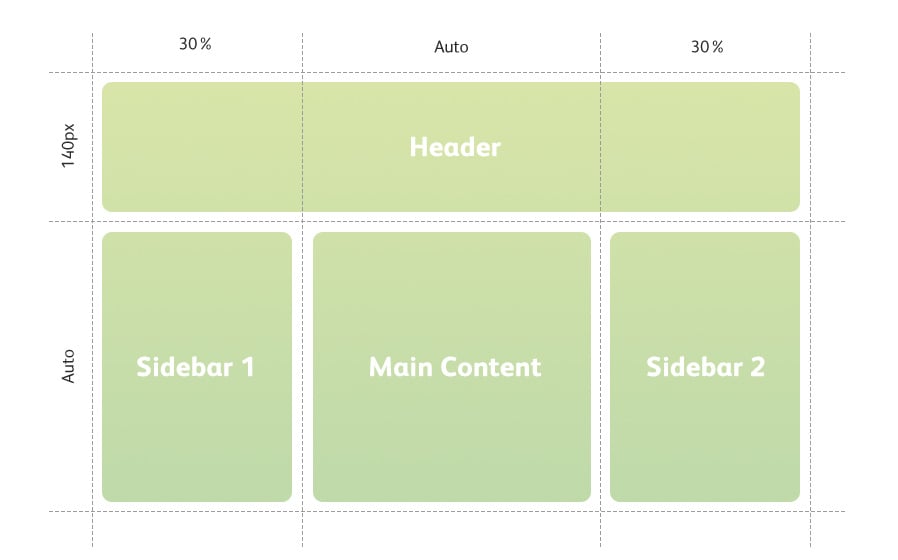
Lets start with some basic HTML including a container <div> with 4 child <div> elements each with numbered classes. This is all we need to start laying things out with CSS Grid Layout.
<div class="grid">
 <div class="grid-area grid-area-1">Header</div>
 <div class="grid-area grid-area-2">Sidebar 1</div>
 <div class="grid-area grid-area-3">Main Content</div>
 <div class="grid-area grid-area-4">Sidebar 2</div>
</div>
How to define a CSS Grid Layout
We use the 'grid' display property to define a block level grid container, or 'inline-grid' for an inline level grid. The 'grid-gap' value defines the space between columns and rows. And then we define the numbers of columns in the grid by using a string of column width values.
.grid {
 display: grid;
 grid-gap: 25px;
 grid-template-columns: 200px 350px auto;
 grid-template-rows: 25% 75%;
 margin: 25px auto;
 width: 800px;
 height: 600px;
}
/*Some simple styling*/
.grid-area {
 font-family: 'Helvetica Neue', Helvetica, Arial, sans-serif;
 background-color: #c1d798;
 color: #fff;
 padding: 50px 25px;
 text-align: center;
}
'grid-gap' and 'grid-template-columns' can be defined with pixel(px), percentage(%) or flex(fr) units. Columns and rows can also be defined as 'auto' or calculations can be used. Defining 'grid-template-rows' is not required for the grid to work, the row height will be automatic if nothing is defined.
How to position elements on a CSS Grid Layout
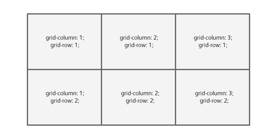
An element's position on the grid is defined by giving it a grid-column and grid-row value, for example the top left corner table cell will always be:
.grid-area-1 {
 grid-column: 1;
 grid-row: 1;
}
Sometimes an area will cover more than one table cell, in this case you can define start and end values for the column and rows. The values used refer to grid lines rather than the grid tracks, so for example an area that spans column 1, 2 and 3 would start at grid line 1 and end at grid line 4.
.grid-area-1 {
 grid-column-start: 1;
 grid-column-end: 4;
 grid-row-start: 1;
 grid-row-end: 2;
}
The shorthand for this is:
.grid-area-1 {
 grid-column: 1 / 4;
 grid-row: 1 / 2;
}
Or, it can shortened even further using the 'grid-area' property instead:
grid-area: 1 / 1 / 1 / 4;
In order the values are row-start, column-start, row-end, column-end.
How to name CSS Grid Layout columns and rows
Columns and rows can be given names to make them easier to reference. This is done on the grid container elements by using square brackets when defining 'grid-template-columns' or 'grid-template-rows' values.
grid-template-columns: [col-1] 200px [col-2] 350px [col-3] auto [col-3-end];
grid-template-rows: [row-1] 20% [row-2] 80% [row-2-end];
Columns and rows can still be referred to by number even after naming them.
Reordering Content with Media Queries
I wrote a tutorial last summer on How to Move a Responsive Sidebar's Position with CSS which relied on using hacks that I discovered by chance, this isn't something that would normally be possible. CSS Grid Layout combined with media queries will provide a real solution to problems like this by allowing you to change where content is placed on the grid at different screen sizes.
This example changes the grid to a single column layout, and also moves the main content area above the first sidebar:
@media only screen and (max-width: 800px) {
 .grid {
 grid-template-columns: [col-1] 100% [col-1-end];
 grid-template-rows: [row-1] auto [row-2] 350px [row-3] auto [row-4] auto [row-4-end];
 width: 90%;
 }
 .grid-area-1 {
 grid-column: col-1;
 grid-row: row-1;
 }
 .grid-area-2 {
 grid-column: col-1 ;
 grid-row: row-3;
 }
 .grid-area-3 {
 grid-column: col-1 ;
 grid-row: row-2;
 }
 .gridarea-4 {
 grid-column: col-1;
 grid-row: row-4;
 }
}
Example Layout
If we put all of this together, we have a very basic responsive page layout using CSS Grid Layout. View the example below:
See the Pen CSS Grid Layout by Tony Thomas (@medialoot) on CodePen.
Conclusion
There is of course lots more to learn about CSS Grid Layout, but what we've covered here are the essentials that you need to get started and build your own CSS Grid Layout. You know how to define a grid, set up columns and rows, name your columns and rows, position your content in grid areas and use media queries to make your grid responsive.
Browser support is an important consideration when using any new technology, so be sure to check that it is appropriate to use for your particular project before jumping in. At the time of writing, CSS Grid Layout can be used with the latest versions of Firefox, Chrome, Safari and Opera. Internet Explorer only has partial support but more importantly you also need to remember that not everybody is using the latest versions of their browsers unfortunately. It may still be a while before CSS Grid Layout is widely used on the web.
If you're eager to learn more about CSS Grid Layout, here are some great in-depth resources:


Comments