

by Diego Sanchez
July 16, 2018
Diego prevents carpal tunnel syndrome in designers worldwide by making incredible time-saving Photoshop actions and mock-ups.


Create an Orange and Teal look in Lightroom
Popular Color Grading
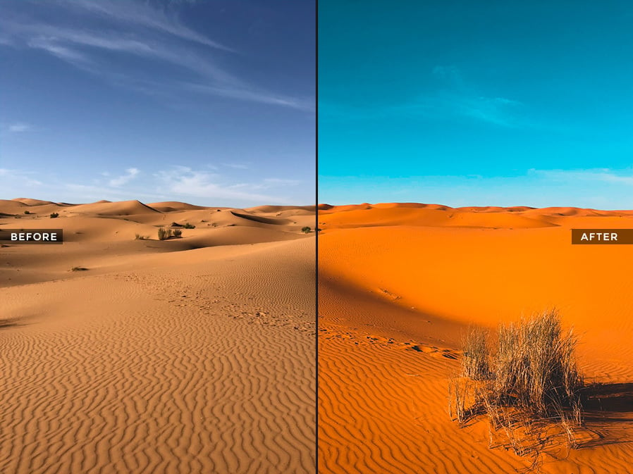
There's a gorgeous color grade that's getting more and more popular: Orange & Teal. You get this fab look by using complementary colors to create contrast and attract visual interest, and there are a few different ways to get there in Lightroom. Some give you more control, while others are quicker to make.
Today, I would like to show you how easily you can achieve this look by changing only 2 values of the Camera Calibration and making an easy adjustment to the Tone Curve in Lightroom which will help you to have the basis of the Orange and Teal look that you can later fine-tune according to the image you are working on.
A good way to show you how this effect work is to use an image that already have some reds/oranges and blues on it. So if you want to follow this tutorial exactly as described, please download the following image from Pexels: Download.
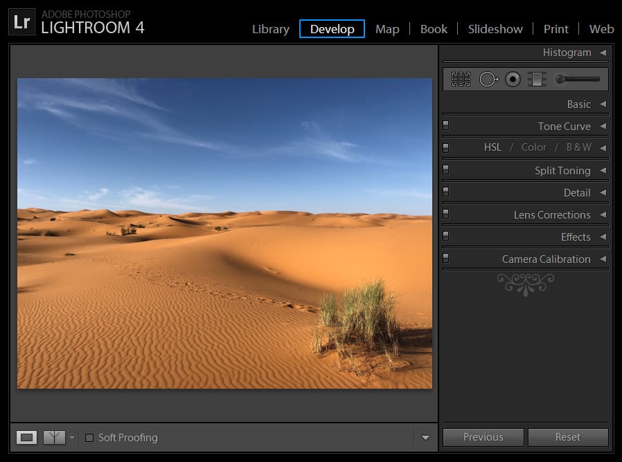
Step 1
Open the image in Lightroom and go to the Develop tab.
Step 2
Under the ‘Camera Calibration’ tab, set the Hue of the Red Primary value to +25.

Step 3
Still under the ‘Camera Calibration’ tab, set the Hue of the Blue Primary value to -100.

Step 4
Go to the Tone Curve tab, and drag the bottom anchor point to approximately 12/12%.

Step 5
Still in the Tone Curve tab, drag the top anchor point to 91/91%.

Step 6
Click once over the Curve to add a new anchor point, and drag it to 50/50%.

Step 7
Again, click once over the Curve to add a new anchor point, and this time set the value to 33/29%.


Notes:
As you may see, we already have the basic values set to our Orange and Teal look in Lightroom. From this point you can start changing any of the values according to the image you are editing or make some variations to the one we are using.
In this case, instead of using +25 in the Hue of the Red Primary value, it is set to +50.
In the following example, the Hue of the Red Primary value is set to +40, while the Hue of the Blue Primary value is set to -90.

Furthermore, you can play with the Hue values under the Camera Calibration tab to achieve outstanding new looks like in the following example where the hue values of the Red, Green and Blue are set to -100.

Additional Tip:
If you plan to use the Orange and Teal look in more than 1 picture, a good idea is to save the settings as a Preset. To do that simple go to your Presets tab, click the ‘+’ sign, give the preset a name and save it. Now, the next time you want to give a photo an Orange and Teal look, you simply need to click once over the Preset to apply the effect.


Comments