

by Tony Thomas
April 24, 2018
Tony creates pixel-perfect UI kits & icons. His pug, Wednesday, is Medialoot's beloved mascot.

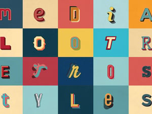
How to Create Retro Stripes Text Effect in Illustrator
Recreate a vintage '70s style stripy text effect
Use Illustrator to create a retro 1970's inspired striped text effect. This tutorial will teach you about drawing letterforms and using custom Art Brushes in Adobe Illustrator.
Step 1
Begin by opening Adobe Illustrator and creating a new document. Choose any screen preset then enter 840 pixels for the width and 420 for the height.

Step 2
Use the Rectangle Tool to draw a 100 x 10 pixel rectangle anywhere on the canvas. Set the fill color to #652e3b.

Step 3
Duplicate the rectangle and use the keyboard arrow keys to nudge it down 10 pixels. Set the fill color of the second rectangle to #ae4860.

Step 4
Repeat the last step to create a third rectangle and set the fill to #de8b6f.

Step 5
And once more, the fill color this time is #de8b6f.

Step 6
Select all 4 rectangles, then from the Brush window (Window > Brushes) choose New Brush... in the modal window that opens, choose the Art Brush option.

Step 7
In the next window, you can pretty much leave everything as it is, just enter a name and click OK.

Step 8
Draw 2 new vertical guides 160 pixels apart from each other close to the middle of the artboard.

Step 9
Use the Ellipse tool to draw a 70 x 70 pixel circle (tip: hold shift key). Then with the Direct Selection tool, delete the bottom left segment. And using the Pen tool click on the leftmost vector point and whilst holding down shift, add a new point on the bottom guide.

Step 10
Select the path you created in the last step and apply the stripes art brush.

Step 11
Use the Pen tool to click on the open vector point and create a new point which extends the line to where it meets the vertical part of the shape.

Step 12
Use the Rectangle tool to draw a 70 x 70 pixel square in lower section which intersects the existing paths.

Step 13
With the Direct Selection tool, select the top right vector point and increase the corner radius to 35 pixels.

Step 14
Double click the shape to isolate it and then delete the left and bottom segments of the shape.

Step 15
Apply the stripes art brush to the new path.

Step 16
Move the bottom section backward in the layer order (Object > Arrange > Send Backward) so that it appears to be below the other shape.

Step 17
For the E, start with a 70 x 120 pixel rectangle. Delete the right segment of the shape, and round the top left and bottom left corners 35 pixels.

Step 18
Apply the stripes art brush to the path.

Step 19
Draw a new line segment which completes the E shape as seen below, and apply the stripes art brush.

Step 20
The T letter is very simple, start with a horizontal 120 pixel line segment and then draw a vertical 120 pixel line below it. Use the align tools to center align vertical section.

Step 21
Select and drag the first R with your mouse whilst holding down the Alt and Shift keys to create a copy.

Step 22
Draw a 70 x 120 pixel rectangle and round the corners 35 pixels to create the O shape.

Step 23
Apply the stripes art brush to the O shape.

Step 24
Head back to the original R and draw a 4 x 40 pixel black rectangle as shown below. Set the Transparency of the shape to 20% to create a shadow effect.

Step 25
Duplicate the main section of the R shape and go to Object > Path > Outline Stroke. Delete 3 of the stripes, keeping only the outside stripe.Then use the arrow keys on the keyboard to nudge the shape down 3 pixels and right 3 pixels.

Step 26
Duplicate the other section of the R shape, outline the stroke and use the Pathfinder (Window > Pathfinder) to Unite the stripes.

Step 27
Select the two new shapes and use the Pathfinder to Intersect them.

Step 28
Move the remaining section backward in the layer order so that it is below the between the two sections of the R shape. Set the fill color to black and Transparency to 20%.

Step 29
Draw another 4 x 40 pixel rectangle for the E and a 40 x 4 pixel rectangle for the T. Place them as shown below, and again set the fill color to black, transparency to 20%.

Step 30
Create a copy of the first R and use it to replace the second one. It is quicker than creating the shadows again.

Step 31
Add a subtle background by drawing an 840 x 420 pixel rectangle with the fill color #e8e0da below all of the other layers.

Result & Conclusion
Add a bit of texture (optional) and your retro stripy text is ready to go! As always, thanks for following along with this tutorial, I hope you have enjoyed it and learned something new. To recap, we have created a custom Art Brush, used shapes and the pen tool to build custom letterforms and used the Pathfinder tool to handle a tricky shadow.


Comments