
by Brad Lenox
November 10, 2015
Brad is the community manager for Glyphs.co. He loves beer, podcasts and Philadelphia.

How to Create a Custom Lettering Piece from an Existing Font in Minutes
Quickly add a handmade quality to your typography
Custom hand lettering has increased in popularity in recent years and is in great demand from clients. Creating the look by hand is a fantastic skill that one has to develop and refine for years. But a similar style can be created with a little bit of creativity and a good script font. In this tutorial Ill show you have to create a custom lettered look from an existing font in Adobe Illustrator.
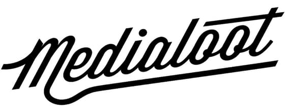
For this example I chose a font called Wisdom Script (http://www.losttype.com/font/?name=wisdom_script). This is a fantastic script font that has a bit of vintage feel. At this point it looks good, but it doesn’t have the custom touches that we’re after.

First up, I decreased the space between the “M” and the “e”. You can do this by selecting the Type Tool (T) and placing the cursor between the letters. Then hold the Option key on the keyboard and use the arrow keys to move the letters left or right. I also tilted the entire word a bit using the Rotate Tool (R). Then I expanded the type by clicking Object | Expand. This will allow us to edit the type as shapes instead of text.

I don’t care for the swoosh on the capital “M”, so I removed it to create our own custom swoosh. You can remove it using the Eraser Tool (Shift+E) or the Remove Anchor Point Tool (-). From there I drew my own swoosh with the Pencil Tool (N). I chose a stroke of 7.5 to match the width of the text. This will vary based on the point size you set for your type. Now I’ll place it on the stem of the “M”.

I also want to remove the the smaller curl on the last leg of the “M” to make room for our own custom swoosh/underline. I erased it with the Eraser Tool (Shift+E). I then drew the underline using the stroke width of 7.5 again with the Pencil Tool (N). I adjusted the curve a bit to line up perfectly.

I want to make the crossing of the “t” longer over the double “oo”. To do that I used the Remove Anchor Point Tool (-) and deleted the small cross. Then I used the Pen Tool (P) to draw a much longer line. I used a smaller stroke of 5 for this path. You’ll want to make sure these lines are parallel and balanced with one another.

Now select all of the shapes and press Object | Expand to convert all of the paths to shapes. Then press the Unite button on the Pathfinder panel. This will combine all of the shapes into one.

This is looking good, but it doesn’t feel quite as balanced as it should. To fix that, we’ll use the Shear Tool, which is located in the pull out menu under the Scale Tool.

Click the word and use a corner handle to skew the image slightly to the right.

As a finishing touch, we’ll need to align the ends of our new angles to match the angles of the type.

To do this, simply grab the Direct Selection Tool, and nudge the points at the end of the added shapes to align them. To help, I created some blue guides to show me the correct angle.

Here’s a look at the final piece. I hope this tutorial has inspired you to create some faux lettering of your own!


Comments