
by Tony Thomas
August 27, 2013
Tony creates pixel-perfect UI kits & icons. His pug, Wednesday, is Medialoot's beloved mascot.
Style Guides: A Design Mock-up for the Responsive Web
Most designers follow a set process when creating websites, but now that we are in the world of responsive design, and websites are accessed on more devices than ever before. Using Photoshop to create design mock-ups is increasingly becoming flawed.
It may vary slightly from project to project and from designer to designer, but the current process usually looks something like the image to the right →
This should look very familiar to a lot of designers. It is the way nearly all creative professionals have worked since the beginning of web design as an industry.
But now that we are in the world of responsive design, and websites are accessed on more devices than ever before. Using Photoshop to create design mock-ups is increasingly becoming flawed.
One of the main concerns with using Photoshop or any other design tool to create mock-ups is that the end product is usually a collection of .psd files that need the styles extracting from them, and static pixel-based layout.
The problem with traditional web design mock-ups
- The design mock-up is too staticA traditional web design mock-up is a set amount of pixels wide, 960 for example. And every line of text, button image and other elements are set in stone. Unlike on the web where these things will inevitably vary between devices, browsers and even the size of the browser window.
- Too much time is spent on pixel pushingDesigners and clients get too caught up in making the design mock-up pixel-perfect. Spending an inordinate amount of time pushing elements a pixel here and there. Hard work which usually goes out of the window when the design is brought to life in the browser.
- Extracting styles is complicatedWhether you are coding up your own designs, or a developer coding somebody else's work. You need to look through your .psd files to find the right element and extract it's CSS properties. But what if you can't remember which page that element was on, or worse is on a page that hasn't been mocked up?
Designing in the browser (and why it doesn’t work)
Okay so using Photoshop is a waste of time and we should design directly in the browser instead right? Well, no. From my personal experience, this is also very unintuitive and limits creativity. Typing your design in code simply doesn’t work. Although you may create a perfectly nice looking result, your ability to try out different ideas and concepts quickly until you find the best way to present your ideas is greatly inhibited.
The benefits to designing in the browser are that it is flexible and responsive, and once you have finished your design you also have it ready to go in the correct medium. So it is something of a time-saver too, but is that really worth limiting your design process so drastically for?
What does work well?
Photoshop mock-ups are too detailed and static, designing in code is too limiting. But one thing that most designers (hopefully) already do on a regular basis is spot on:
Wireframes
Wireframing is a great way to plan a project, it is quick and extremely flexible. It can be done on paper, with the aid of software like OmniGraffle, or with tools you are already familiar with such as Photoshop and Illustrator.

A wireframe is not just a quick ideas sketch though, it can also serve as a blueprint for a design, much like an architect would hand over to the contractors when designing a building. With this wireframe/blueprint in place we are half way to having everything we need to starting building the design in code. The other half that’s missing is the styling, or ‘visual language’.
Defining the visual language
If we are happy to use wireframes to layout the structure of a web project, we need something else to go with them that defines the visual language of the project:
UI Style Guides
Introducing ‘UI Style Guides’. In the print industry something very similar to this already exists, usually referred to as ‘Branding Guidelines’ and they work. We can adapt this idea to also work for web and interface design.
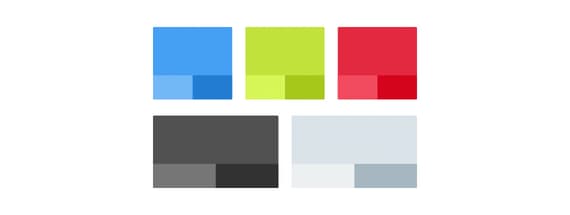
Unlike branding guidelines, which focus on color schemes, and when and how to display a company logo. UI style guides will focus on the visual language, and interface elements. The best way to explain this is with some examples:


The result?
By combining wireframes and ui style guides, we can separate the visual language from the structure. Something which is often difficult for clients to do when they are presented with a complete mock-up. It becomes possible to make quick and easy changes to the layout without needing to worry about the styling. And likewise if the client wants to make changes to the visual language, it can be done without worrying about updating multiple elements across multiple pages.
How will the client react to this? Well, it’s hard to say at this early stage. But if you explain in initial meetings how you intend to present your ideas, and the benefits of working this way, as an alternative to traditional mock-ups. Then the client should understand what to expect, and hopefully appreciate it.
UI Style Guide template
We have created a UI Style Guide Template to get you started. Download it for free now and challenge your current workflow.
Comments