
Introducing the New Medialoot
For the past nine months we've been working on something huge at Medialoot—a complete redesign and rebranding of our entire website and image. We are extremely happy to announce that it is finally live and ready for your viewing pleasure.
The new site went live just a few days ago sometime after 1am EST (in the hours where even excessive coffee fails to help) and we've been running around polishing everything up since then. Now that everything is in place and working smoothly we're going to give everyone a little glimpse of the enormous effort that our whole team put in to pull off this overhaul.
The Goal
The goal of our major Medialoot redesign was twofold: to bring our brand and image into the modern world of design, and to create a product that would be more usable and more useful to our members.
In terms of usability this boils down to making things easier and more intuitive to find. We completely revamped our searching system, resource organization, and many other aspects to make this happen.
Modernizing our image was the easier part of our two goals and essentially comes down to using better design. What was very tricky about this part was creating a new logo; fellow designers out there will empathize with how difficult it can be to distill an entire brand down to a single image that's supposed to be beautiful, memorable, clever, and simple...
Redesigning the logo
The first part of our process started with the Logo. We had been wanting to re-do the logo for a really long time and this seemed like a reasonable first step. It's also great to have a finalized logo to use to set the tone for the rest of the design process.
Some initial concepts:
Started to get a little closer, explored more of the "design tools" avenue:

We ended up not loving the above concepts and went in a slightly different direction. This logo emphasized the idea of art/creativity and also the process of moving from concept to final design (which is where we want to help):

And, finally, we distilled a lot of those ideas into a cleaner logo that is more our style, works better in a variety of applications, and is something everyone over here at HQ really loves. Over one hundred concepts and four designers later, I present you with our final design:

That turned into quite an ordeal :)
Remaking the website

The screenshot to the right is of our old homepage. Not the worst thing in the world, but we had a lot of modernization to do...
One of the first things we did was make the decision (which I think is important) to display our resources directly on the homepage as opposed to the previous version which was more of a sales page. This decision drove a lot of our design process: the homepage, category pages, browse page, and search pages all now follow the same essential framework. The big benefit of having all of these pages follow one system is that it makes our life a bit easier: create one interface that is used almost everywhere.
This primary interface was where we started our design process: you can see sketches and the final product in the images below.
"One of our main goals was increasing the usability of the site: which in our world means making it easier for users to find the resources they are looking for"Mason Hipp
In addition to our primary interface template (used on the home and browsing pages) one of the first parts we started with on the redesign were the actual resource boxes: again a critical element of our user interaction and product display. Here's a sketch (my drawing is terrible):

That sketch is one of dozens of wireframes and sketches that I made during the process of the redesign (sketching and revisioning were my primary design involvement, Tony Thomas and Sebastiano Guerriero did the majority of the design work). Once our two talented designers finished with the process we ended up with the beautiful resource boxes we have now:

Here's another example of the sketch-to-design process. I couldn't find the header sketch so this was the next best thing.

And a final look at the differences:

Sorting and organizing the design resources

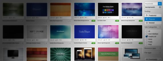
In addition to the structural changes of the website, we also focused a considerable amount of time on the resource sorting and organization itself. Everything has been recategorized, sorted, and placed into a system that makes finding stuff easier.
The core effort of our organization involved breaking our resources into "collections" or top-level categories that make sense. There are a lot of ways to slice a group of resources: by usage, by user type, by style, etc. In the end we decided on the five main collections you see in the header (we don't really count freebies, it is more of a pseudo-collection).
These five collections keep different items in areas that make sense: interface designers will be right at home in the UI collection, art and graphic designers will find essential source materials in the graphic art collection, and anyone who needs fonts or icons will know exactly where to find them.

Along with the above collections we totally revamped our sorting bar to provide a huge variety of ways to find a resource. It's possible to search for multiple keywords, search everything or only within a collection, search for specific filetypes, resource types, download types, and much more. Our goal was to give users multiple ways to find things: the end result being a variety of paths based on what you want to search for and how you want to find it.
Slice, code, integrate, launch
Although on the surface this redesign was primarily about updating the look and feel of our website, the reality is that much of our most difficult changes were made to the backend infrastructure that runs the site.
Over the past several months we've written and rewritten thousands of lines of code, the majority of which was from the capable hands of our star developer Natalie. Here are just a few of the improvements we've made:
- Completely new single-purchase system The new system is faster, easier, and much more reliable. It also works better in more countries.
- Dramatically improved searchPart of our "make it much easier to find stuff" initiative. We're still tweaking the weighting and algorithms, but it is already a whole lot better.
- Better and faster caching Because everyone prefers a faster website. We've got more to go on this front...
We've also added a lot of dynamic (AJAX-y) elements to the user experience. Mostly we think this has helped a lot, but we are still working on some areas that could use improvements (logins, going 'back' to search results, etc...) As with every large project like this there are a lot of ongoing revisions and improvements.
What do you think of the results?
At the end of months of hard work, many late nights of work, and a really long blog post. The end result of our redesign is here:

What do you think of the new design? Any suggestions, preferences, something you love or hate?
Our changes and revisions will be ongoing for a long time—and much of what we do will be in direct response to what our users want. Let us know your thoughts below!

Comments