
How to Use Grid Layouts with WordPress and Bootstrap 3.0
In this tutorial, we’ll be taking a look at how to implement a Bootstrap design in WordPress. Before we begin, we'll dive into the beauty of grid layouts and how they have allowed quick design solutions in terms of functionality, organization, and responsive design. Then, we we talk about the basics of Bootstrap, followed by how it can work together with grids to create amazingly easy grid layouts of your featured images on your index and category pages in Wordpress, without complicated math.
What is a grid layout and why use one?
Grid layouts are used to create page layouts and can be very simply described as a series of rows and columns that contain your content.
Grid layouts have their roots in graphic and print design and have been widely adopted online over the past few years. In web design most grid layout frameworks use a combination of div HTML elements and CSS for positioning, though some also make use of JavaScript. As they provide a basic structure, grid layouts can reduce development time and help create consistent layouts that are easy to update.
"Grid systems can facilitate creativity by providing a framework and already answer some designers questions such as ‘where should the folios go’, ‘how wide should the measure be?’ etc. A well designed grid system will go some way to answer these questions and more."Mark Bolton
What is Bootstrap and why use it?
Bootstrap (previously referred to as Twitter Bootstrap) is a framework that’s designed to act as a starting point for front-end design. It contains multiple elements that are regularly used when designing a website such as common CSS styles, font and icon libraries as well as useful JavaScript components for common user interactivity like carousels, drop down menus.
While other development frameworks are available, Bootstrap is arguably the de facto front-end framework for designers and developers. One of Bootstrap’s core features is its grid layout, which is sometimes referred to as scaffolding. This system allows you to build flexible layouts without all the complexities of trying to align divs and it can be easily used to build complicated multiple grids within grid based layouts.
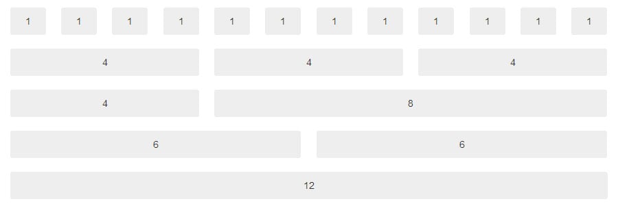
The default Bootstrap grid system is based around 12 columns and you can have up to 12 vertical columns within any given container.

You define columns as class names for example:
<div class="row">
<div class="col-md-4">.col-md-4</div>
<div class="col-md-8">.col-md-8</div>
</div>
The code above would produce a layout with a column that is 4 columns wide and a column that is 8 columns wide. This replicates a traditional blog layout with a left-hand sidebar look.

Bootstrap provides the ideal starting point for new themes and for getting creative. But with a little combination of Bootstrap and PHP in a WordPress theme, you can create something far more complex and appealing.
Bootstrap is often used as the basis of WordPress themes. If yours isn’t, or you’re designing your theme from scratch, Marco Ghislanzoni has put together a very clear guide to adding Bootstrap 3.0 support to your theme. Alternatively, if you’re creating your own theme, then there are several Bootstrap skeleton themes that you could use as a starting point, including Roots, WP-Bootstrap and BootstrapWP.
Going beyond dull 1 column layouts
There has, over the years, been a slow shift away from home and category page layouts being traditional one column loop with or without a sidebar to more magazine-like layouts. The WordPress default theme is no exception and the latest incarnation Twenty Fourteen has arguably had the biggest design overall of all the default theme updates, switching from the one column layouts to a more magazine-esque style.


Getting started
Throughout this tutorial, we will be using Bootstrap 3, which was released in August 2013. Older themes may not be using the latest version, so it’s worth checking your theme’s documentation before you begin. With our Bootstrap enabled theme and by combining grid layouts of Bootstrap 3.0 with WordPress, let’s look at building 2 interesting layouts that go beyond the simple single column layout.
Creating a variable column view within the loop
The example below uses a simple repeating pattern to show 2 full width posts, followed by 2 half width posts side by side. We’ll replicate this without any complicated math, simply interacting with the page loop inside our theme’s files.

In this example we’re setting a $span variable which can then be echoed in the class area within your article excerpt. We can then pair this with an image grid powered by the Bootstrap frameworks thumbnails feature and your posts’ featured images so you’ll get a grid-based featured post layout. First let’s take a look at the HTML:
<h2>My featured posts:</h2>
<ul class="thumbnails">
<li class=”col-md-6”> <a class="thumbnail" href=”example.com”><img src=”example.jpg”></a></li>
<li class=”col-md-3”> <a class="thumbnail" href=”example.com”><img src=”example.jpg”></a></li>
<li class=”col-md-3"> <a class="thumbnail" href=”example.com”><img src=”example.jpg”></a></li>
<li class=”col-md-6”> <a class="thumbnail" href=”example.com”><img src=”example.jpg”></a></li>
…
</ul>
Now let’s take a look at the code:
<?php
	//Set the initial count outside of the loop.
	$count = (int)0;
	//Start the post loop
	while (have_posts()) : the_post();
?>

<h2>My featured posts:</h2>

<ul class="thumbnails">

<?php
	//Set the span to our default span12
	$span = 'col-md-6';
	//If the count is 2 or 3 change span to be span3. You can put whatever conditions you want here
	if($count == 2 || $count == 3){
   	$span = 'col-md-3';
	}
	//If the count is equal to 3 or higher (which it should not be) then reset the count to 0
	if($count >= 3){
   	$count = 0;
	}
	//If its not 3 or higher, increase the count
	else{
   	$count++;
	}
?>

<li class="<?php echo $span; ?>">
	<a class="thumbnail" href="<?php the_permalink(); ?>">
 	<?php the_post_thumbnail(); ?>
	</a>
</li>

<?php
 //End the post loop
 endwhile; else:
?>

</ul>

<style>
//additional styles required for grid
.thumbnails .col-md-6 img {
 max-height:400px;
}
.thumbnails .col-md-3 img {
 max-height:200px;
}
</style>
This will output as:

The above code can be used inside any WordPress loop, for example in most themes the main loop that shows all your recent blog posts can be found in your index.php file but you could also use this on a category page. A word of caution though before you plough ahead and overwrite what is there already — our example only displays a featured image for each post, so you may wish to modify it to overlay your post title, excerpt, publish date, comment count, author name etc.
Going a little bit further
Using the same principle as above, let’s get a bit more advanced and switch between 2 separate grid layouts. The first layout uses the spans 4 then 2,2,2,2 with the second loop using 6 then 2,2,2 before switching back.
<?php
	//Set the initial count outside of the loop.
	$count = (int)0;

	//Start the post loop
	while (have_posts()) : the_post();
?>

<h2>My featured posts:</h2>

<ul class="thumbnails">

<?php
	//Set the span to our default span12
	$span = 'col-md-4';
	//If the count is 2 or 3 change span to be span3. You can put whatever conditions you want here
	if($count == 1 || ($count == 2 || $count == 3 $count == 4 || $count == 6 || $count == 7 || $count == 8){
   		$span = 'col-md-2';
	}
	if($count == 6){
		$span= ‘col-md-6’;
	}


if($count >= 8){
   	$count = 0;
	}
	//If its not 3 or higher, increase the count
	else{
   	$count++;
	}
?>


<li class="<?php echo $span; ?>">
	<a class="thumbnail" href="<?php the_permalink(); ?>">
 	<?php the_post_thumbnail(); ?>
	</a>
</li>


<?php
 //End the post loop
 endwhile; else:
?>
</ul>
<style>
//additional styles required for grid
.thumbnails .col-md-6 img {
 max-height:400px;
}
.thumbnails .col-md-3 img {
 max-height:200px;
}
</style>
The code will produce a HTML list like before:
...
<li class="col-md-4">...
<li class="col-md-2">...
<li class="col-md-2">...
<li class="col-md-2">...
<li class="col-md-2">...
<li class="col-md-6">...
<li class="col-md-2">...
<li class="col-md-2">...
<li class="col-md-2">...
...
Which will generate a layout that looks like this:

As with our first example this layout only includes the posts’ featured image without any additional content, but would work particularly well on photography blogs and sites which make heavy use of their featured images.
Going all responsive
Bootstrap 3.0 has been designed with the idea of a “mobile first” principal and has several neat features for responsive design. In previous versions of Bootstrap, the grid was static and denoted using class spanXX where xx was the number of columns. In Bootstrap 3.0 this is represented by using col-md-XX as we’ve seen above.
The “md” stands for Medium devices which are classified as those 992px or above. So “col-md-XX” means on a medium device show XX columns across. On smaller devices it would revert to stacking on 100% width, and columns would drop beneath each other.
Likewise, you can specify the layout for other device sizes for example “xs” refers to Extra small devices which are defined as less than 768px. So “col-xs-XX” would will mean that on any device less than 768px such as a phone, show XX columns across.
| Extra small devices | Small devices | Medium devices | Large devices |
| 768px | ?768px | ?992px | ?1200px |
| col-xs-XX | col-sm-XX | col-md-XX | col-lg-XX |
The ability to mix and match columns is really useful if you don’t want your columns to stack on smaller devices as it allows you to specify the layout for each device size. For example:
<div class=”col-lg-4, col-md6>
</div>
<div class=”col-lg-8, col-md6>
</div>
The code above would generate two columns of equal size on a medium size device and, on larger devices, two columns of different sizes one column wider than the other to take advantage of the extra screen space)
Alternatives to Bootstrap
There are alternative grid based systems and frameworks and the examples above could be implemented using a different grid system, grid library, or framework. You could even design your own!
- An Alternative Grid SystemUnsemantic is the successor to the very popular 960.gs and another very popular grid based system. Like Bootstrap, Unsemantic is also a responsive based grid system. However, unlike Bootstrap or the frameworks below, it is just a grid system with no other features which makes it small and versatile.

- Alternative FrameworksBootstrap itself is a large front-end development framework which, as we mentioned earlier, is more than just a grid system. There are many other popular development frameworks. Notable alternatives include YUI and Pure which both have their own take on grids.
Going Further?
This was merely an introduction to how the Bootstrap 3.0 grid system works. We have focused on displaying content from WordPress index and category pages, but it can be used in just about anything. How about an unusual layout for your footer or header? Or with the growing trend for infinite scrolling how about infinite grids?
Bootstrap has opened up theme development and made implementing flexible layouts easy for anyone. Of course some people might not think that this is a good thing. But, for many, it’s a design godsend. We’d love to hear what you think.
Comments