
by Tony Thomas
February 08, 2012
Tony creates pixel-perfect UI kits & icons. His pug, Wednesday, is Medialoot's beloved mascot.
How To Create An Epic Metallic Band Logo
Every band understands the importance of their visual image, and how that come across to their listeners. A big part of that visual image for most musicians is in their logo, it's what's printed on their CDs, posters, T-shirts etc. And the beauty of a band logo is that, unlike it in world of business, a band logo can often be a lot more liberal with special effects, atmosphere, and impact. Which can lead to some very exciting results.
Required Resources
For this tutorial you will need a few files handy. We have prepared some free samples of our premium resources for you to use: You will also need this font to follow the tutorial exactly: Ethnocentric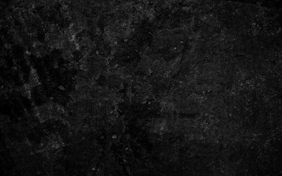
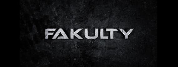
Final Result Preview
Before we get started, here is a preview of what we will be creating: (click for full size)Step 1
To start off, launch Photoshop and create a new document, RGB Color, width 1200 pixels, height 600 pixels and 72 pixels/inch.
Step 2
Grab the free sample from the Dark Grunge Textures pack, and place in on the canvas. It should fill the whole document horizontally and overlap slightly vertically. This will be our background layer.
Step 3
Find the Adjustments panel and add a new Brightness/Contrast adjustment. (In older versions of Photoshop Image > Adjustments > Brightness/Contrast). The current background image is a little strong so we're going to tone it down by reducing the Brightness and Contrast.
Step 4
Add a Hue/Saturation adjustment (In older versions of Photoshop Image > Adjustments > Hue/Saturation) Check the Colorize box and move the hue into the blue region and reduce the saturation to 10. This will give a very subtle cold tint to the background.
Step 5
Next we're going to add our logo type, using the Text Tool, type your band name in the center of the canvas. I'm going to call my band "Fakulty" a nice industrial name. And we are using the Ethnocentric font here.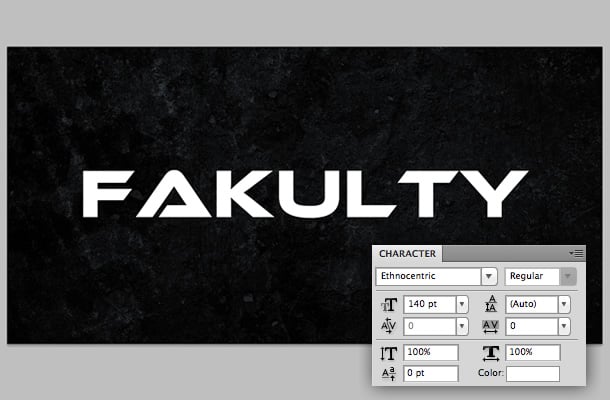
Step 6
The kerning is a little messy by default, so tidy this up by reducing some of the larger gaps between the letters.
Step 7
Our text is sitting quite flush now, but we're going to make some slight adjustments to the font to improve it further. Right click the text layer and "Convert to Shape"
Step 8
Now using the Pen or Direct Selection tool adjust the vector points on the text. In the image below I have highlighted which areas of the text I modified. On the "F" I tucked it in a little bit to line up with the slant of the "A". I removed the slant on the "L", and switch the direction of the slant on the "T". Take some time with this step and make sure you get it just right. Also if you are using a different font or band name, familiarize yourself with the fonts characteristics before you start making edits, otherwise it won't seem natural.
Step 9
Change the color of the text, I've gone with a slightly darker, desaturated blue for a cold feel.
Step 10
Now it's time to add some layer styles. These might seem a little harsh at first but they get toned down by extra layers added later. First up, Drop Shadow:
Step 11
Bevel and Emboss:
Step 12
Contour:
Step 13
Gradient Overlay:
Step 14
Stroke:
Step 15
After applying the layer styles, you should have something looking a little like this:
Step 16
Duplicate your logo layer so that it is placed directly above the original that we just applied effects too. Make the new layer white again, and clear it's layer styles.
Step 17
Grab the free sample from the Metal Scratches set and place it on the canvas. The texture should just about cover all of the text. Make sure it is infront of the white logo layer and right click and "Create Clipping Mask".
Step 18
The texture should be trimmed to the shape of your logo. We're just going to increase the dark areas of the texture by tweaking the Levels (Ctrl/CMD + L)
Step 19
That looks good as it is, but a good technique to increase the detail of a grunge texture is to duplicate the layer, Invert (Ctrl/CMD + i) the colors, and Flip Vertical. Then reduce the Opacity to about 35% so that the original layer can be seen too.
Step 20
Group (Ctrl/CMD + G) the two texture layers, and the white logo layer (the clipping mask). Then set the Blending Mode of the group to Hard Light.
Step 21
The logo looks pretty awesome now, but just to finish off let's add a bit of lighting. Draw a white Ellipse shape covering the logo.
Step 22
Apply a Gaussian Blue at around 75.
Step 23
Adjust the Blending Mode of the layer to Soft Light, and set the Opacity to around 75%.
Step 24
Now for a subtle shadow in the background. Duplicate the logo layer again and color it black. Move it behind the original logo layer.
Step 25
Distort the shape slightly using the Perspective tool (Edit > Transform > Perspective).
Step 26
Finally, add a Gaussian Blur to the shadow layer to finish it off.
Comments