

by Tony Thomas
May 26, 2011
Tony creates pixel-perfect UI kits & icons. His pug, Wednesday, is Medialoot's beloved mascot.
How To Create a Pretty Little Login Box in Fireworks
In this tutorial we will use Adobe Fireworks to create a sharp, pixel perfect login box, using basic Fireworks techniques that can be applied to most User Interface (UI) elements for the web or in desktop and mobile apps.
Final Result
Let's begin by having a look at the final product we will be creating in this tutorial.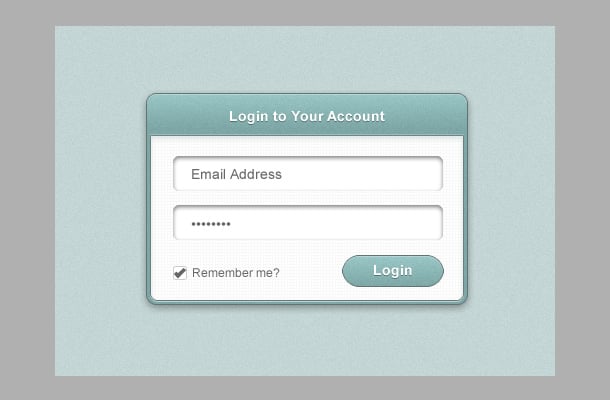
Step 1
The first step is to set up the document. Start by launching Fireworks and opening a new document (ctrl/cmd+n). Set the width of the document to 500px and the height to 350px.
Step 2
Grab the Rectangle Tool and draw a new rectangle that fills the whole document, this will be our background layer, you can align it to the edges of the canvas, or for ease just make it a few pixels larger. Set the color of this rectangle to #C3D6D5. Next go to the Live Filters section of the Properties window and click the New Filter button, select Noise > Add Noise.. And set the Amount to 2.

Step 3
Select the Rounded Rectangle tool and draw a new rectangle in the center of the canvas, use the Auto Shape Properties window to set the dimensions of the shape to W: 320 H: 210. Set the radius of all corners to 10px. Tip: Avoid using the Properties window on auto shapes like the rounded rectangle as it can distort the shape and leave you with disproportionate corners, always use Auto Shape Properties.
Step 4
Apply a gradient fill to the new rounded rectangle we have just drawn.- Set the fill of the rectangle to Gradient >Linear.
- Set the first color stop to #99C6C6
- Set the second color stop to #7DA6A6
- Drag the second stop towards the left (at about the 20% position)

Step 4
This step is a big one, involving lot’s of live filters to give our shape some depth, Start with the Add Noise live filter, Amount: 2. Apply an Inner Shadow filter:
- distance: 1
- color: #ffffff
- opacity: 29%
- softness: 0
- angle: 270
 Then we will apply a Photoshop Live Effects for the stroke, select the Stroke and set the Size to 1, and Fill Color to #617373.
 Tip: Using Photoshop Live Effects to apply a stroke let’s you control the order in which the outline of an object is applied in relation to other effects (unlike the native stroke function), in this example we want to apply the stroke after the inner glow, not before.
Photoshop Live Filters are only available if you have Adobe Photoshop installed on your system, but if you don’t have them, then just use the standard Fireworks stroke and omit the inner shadow.
Finally, add another Drop Shadow filter:
Tip: Using Photoshop Live Effects to apply a stroke let’s you control the order in which the outline of an object is applied in relation to other effects (unlike the native stroke function), in this example we want to apply the stroke after the inner glow, not before.
Photoshop Live Filters are only available if you have Adobe Photoshop installed on your system, but if you don’t have them, then just use the standard Fireworks stroke and omit the inner shadow.
Finally, add another Drop Shadow filter:
- Distance: 3
- Color: #000000
- Opacity: 35%
- Softness: 8
- Angle: 270
 We’ll be using a similar set of effects to this later for the button so click the Add New button (just the right of the filters section) to save this style to the Document Library. Make sure Fill and Stroke styles are selected and Effect.

Step 5
Draw another rounded rectangle and in the auto shape properties window unlink the corner radius values using the padlock icon and set the top row of values to 0 and the bottom row to 7. In the Properties window, locate the Texture field below the fill options, click on drop down menu and select Hatch 2 from the list of preset textures, set the opacity to 5% and select the Transparent option.

Step 6
Time to add some more effects, go the filters section of the properties window and apply the following effects: Inner Shadow:- Distance: 1
- Color: #ffffff
- Opacity: 29%
- Softness: 0
- Angle: 270
- Effect: Stroke
- Color: #617373
- Size: 1
- Distance: 3
- Color: #93AEAE
- Opacity: 36%
- Softness: 6
- Angle: 270
- Distance: 1
- Color: #ffffff
- Opacity: 50%
- Softness: 0
- Angle: 270
- Distance: 1
- Color: #ffffff
- Opacity: 25%
- Softness: 0
- Angle: 90

Step 7
Use the Text Tool (T) and create a new text area above the existing layers, type “Login to Your Account” and apply these text values in the properties window:- Font: Arial (or Helvetica)
- Style: Bold
- Size: 14
- Color: #ffffff
- Align: center
- Distance: 1
- Color: #000000
- Opacity: 35%
- Softness: 0
- Angle: 270
 Align your text as shown in the image above.
Step 8
Draw a new rounded rectangle and set the values to W: 270 H:35 and Corner Radius: 7. Place it as shown in the image below and apply an inner shadow filter:- Distance: 2
- Color: #000000
- Opacity: 50%
- Softness: 4
- Angle: 270
 Use the Pointer Tool (V, 0) and click and drag the rounded rectangle, holding down the Alt key will make a copy of the original shape.
Place the duplicated rounded rectangle below the first one as shown below.
Use the Pointer Tool (V, 0) and click and drag the rounded rectangle, holding down the Alt key will make a copy of the original shape.
Place the duplicated rounded rectangle below the first one as shown below.

Step 9
Create a new text field above the top rectangle, and type in “Email Address”, then apply these values in the properties window:- Font: Arial (or Helvetica)
- Style: Regular
- Size: 14
- Color: #666666
- Align: Left
 Duplicate the layer and nudge it down to the field below, for the password field copy this bullet point character to your clipboard ( • ) and paste it 8 times into the text field.
Step 10
Duplicate one of the text layers and nudge it down towards the bottom left hand side of the window, reduce the font size down to 12 and enter “Remember Me?”.
Step 11
Draw a small rounded rectangle, the values in the Auto Shape Properties window should be:- W: 12
- H: 12
- Corner Radius: 2
 Now draw two rectangles making a backwards ‘L’ shape. The tall shape should be W: 3px by H: 11px. The bottom shape should be W: 6px by H: 3px.
 Select both shapes (Shift+click) and use the Scale Tool (Q) to rotate the two shapes 45 degrees clockwise.
 This shape forms our tick icon for the check box. And your document should be looking something like the image below now.

Step 12
Draw another rounded rectangle for the button, set the auto shape properties to W:100 H:30, Corner Radius: 17.5.
Step 13
Open up the Style window (Window > Styles) and click on the style we created earlier, this will apply the gradient fill and all the effects that we put on the first shape we created. These effects aren’t quite right for a button though, the gradient for a start could do with being more evenly spread not focused at the top. So in the gradient fill options drag the second stop all the way over to the right.
 That shadow is a bit too much for a button too, so we can disable that altogether by clicking on the tick icon in the filters list.
 To save a variation of the style just click the Add New button again, enter a new name, and hit OK.

Step 14
For the text on the button we can use the same text that is used on the window title, so Alt+drag the ‘Login to Your Account’ text down to the button and place it on top. Change the text to say “Login”
Conclusion
And that’s it, you’ve just used Fireworks to create a pixel perfect, pretty little login box, the techniques covered in this tutorial were carefully picked to be applicable to almost all UI elements, so you shouldn’t have any problem creating a wide range of buttons, sliders, scrollers and form elements in the same style. Thanks for reading!End Result
Comments