

by Bridgette Mabuto
November 12, 2018
The right word in the right place makes all the difference.
21 Mid Century Modern Fonts that Capture the 1950s and 60s
Fonts that are SO Mid-Century
Mid-Century modern fonts capture the optimism and hope that embodied the postwar world, with fun and bold lines and dramatic swashes.
I’ve always found it extremely interesting how the culture of an era can influence the design and style of that time.
That sounds super pretentious, so let's move along.
Mid-century fonts are a perfect example of a culture being seen in design. In the 50s and 60s, the world was recovering from a horrific world war. People were trying to move on from the trauma and focus on the good and the happy.
That spirit of optimism is seen in the designs of that era, including in the fonts. Think about the lettering used in classic TV shows, like I Love Lucy, The Honeymooners, and Leave it to Beaver. They were fun, quirky, and lighthearted.
The style is classic and fonts are still being modeled after them to this day.
We’ve collected a list of premium and free mid-century modern fonts that capture the spirit of the 50s and 60s.
Let us know your favorites in the comments below!
Drive-In Mid-Century Font - $7

It almost seems unfair to start with the best, because it’ll be all downhill from here. But, alas, here we are! Medialoot has created this gorgeous mid-century sans serif typeface that embodies the style and feel of that era.
With your purchase, you’ll get both the solid and inline varieties of the font.
Stiff Staff Font - Free

Stiff Staff is an exaggerated, decorative font that has all the precise lines and edges that were so well-loved in the 1950s and 1960s. The free font comes with all the symbols and letterings you could ever need, so go get it!
Milan Vintage Sans Serif Font - $15
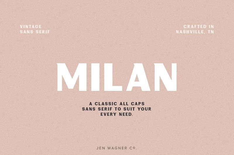
Milan has found a way to blend the modern with the more aged look of a sans serif font. The vintage typeface is an all-caps option that manages to work both in body, headers, and logos.
Remachine Script – Free

It doesn’t get more mid-century than Remachine Script. The font is dramatic and bold, with thick lines and graceful curves. It screams old-timey diner or drive-in movie, all the vibes you want for a mid-century, vintage font.
Windpeak Script Font - $14

What makes Windpeak so unique is that it was actually modeled after American apparel from the 1950s. So, when we call this a genuine mid-century font, we’re not joking. The swirls and vertical strokes make it feel vintage and rustic, something that is felt in every letter.
The Lunch Box Font Set - $28

The Lunch Box Font Set is the epitome of the 1950s and 1960s. And with this pack, you don’t just get one amazing font, you’ll get 10! From a neon hybrid font to a typeface that is reminiscent of the show Bewitched, there is no shortage of mid-century options for you!
KTF Roadstar Font – Free

KTF Roadstar is a simple, but effective, font that embraces all that is mid-century typeface. The strong lines, the dramatic swirls, and the hand drawn feeling are all elements that make KTF such a versatile font option.
Airstream Font – Free

If you’re looking for a script that cries retro, Airstream is the choice for you. With its thick yet subtle lines, Airstream is perfect for branding or logos.
Lucy Script – Free

What is more 1950s than I Love Lucy? The classic show is memorialized in this classic mid-century font. Lucy Script is so dainty and so beautiful, it’s best used in moderation. Then again, when did Lucy ever do anything in moderation?
The Brown Bag Font Set - $28

We’re going super classic with this set of gorgeous fonts. The Brown Bag pack comes with 10 diverse and unique fonts that will be perfect for any of your mid-century projects.
Avelana Bold Font – Free

This is one of the more delicate font options on this list and also a fast favorite. Avelana, which looks like it could be used for a Cuban nightclub sign, comes in thin, medium, and bold weights. And with its variety, Avelana is able to be gorgeous and versatile.
The Roxers Typeface - $13

Coming in Normal and Rough forms, The Roxers Typeface is a handmade font that is beautifully retro and vintage. The font is also very versatile, making it an ideal option for branding, ads, print, and textiles.
Hamburger Heaven – Free

With its 1950s feel, Hamburger Heaven is the perfect mid-century font for headings and titles. The freebie comes with classic straight lines and slight swishes to add a bit of drama.
Madness Hyperactive Font – Free

Madness Hyperactive is as it was named. The quirky typeface has a retro comic feel that makes it a perfect ode to 1950s cartoons.
TV Dinner Font Set - $28

Not all of the fonts that come in this set are specifically mid-century, but we had to include the pack because it really has some gems. Singlesville Script and Dry Cleaners both point to 1950s and 1960s styles.
American Captain Font – Free

American Captain gets its inspiration from a very obvious source. And while that specific story might have taken place in the 1940s, the style carried through the 50s and 60s.
Seaside Resort Font – Free

Maybe it’s just me, but Seaside Resort reminds me of Agatha Christie novels. The shadowed, thick lettering brings to mind old seaside villas where there’s bound to be a murder. Just saying.
Casino Buffet Font Set - $28

Another set of amazing mid-century fonts that just scream the golden age of television. The various typefaces come in the classic, like Lamplighters Script, and the zany, like Mirage Zanzibar.
Studebaker Font – Free

Like the classic car it was named after, Studebaker is a sleek and timeless font. The clean lines make it perfect for headers and branding, but the varying weights give it a fun personality.
Palm Canyon Drive - $19

Inspired by California in the 50s, Palm Canyon screams old Hollywood. Because the font was based off retro road signs, matchbooks, and postcards, it is perfect for social media and branding. Of course, if you have a diner you want to make a sign for, no font will serve you better!
The Boller Typeface - $15

Boller might be one of the most quirky font options on this list. But its perfect blend of mid-century modern and the drama that was the 1960s makes it a great choice for print, stationary, and textiles.
Comments