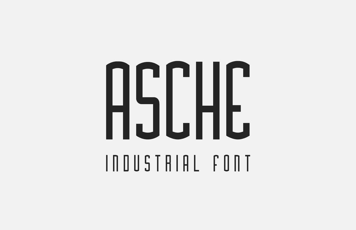
Asche Desktop & Web Font
This unique desktop and web font is inspired by vintage industrial logo-types, and makes for a powerful headline font. It includes all common glyphs including lower and uppercase characters, numbers and symbols.
This font is supplied in 3 different weights:
- Bold (Free)
- Regular
- Light
Free License
Feel free to download and use this item for both personal and commercial projects with attribution back to MediaLoot. Please note:
- Attribution is required for free items. For a non-attribution license, please become a member or buy the full version.
- You may not distribute or offer this set for download on other websites. Promotion is always appreciated, but please send people to this page.


Comments
Loving the web fonts! Keep them coming! I’m sick of using the usual fonts on the web.
Thanks Jordan
Glad to hear you like it, a lot of effort went into this one
-Tony
thanks Jordan. well done.
Hi, it is possible to use this font in a App (Apple/Android) ?
Thank you Tony- great job!
Thanks for the comments!
@Davide Michel Morelli:
Sure you can use it an app, the only condition is that attribution is required for non-members. If you’re a paying a member you’re good to go!
-Tony
Hi Tony, Nice font. Too bad there’s no “é, à,” etc. as I live in a bilingual world.
@Guylaine: Thanks, I’ll be sure to included accented characters in a future update, if you checked the “Notify me of follow up comments” box, I’ll post another comment when they’ve been added.
@tony: thanks, In a similar “credits” page is ok ?
M.
Yeah that should be fine, there aren’t any specific guidelines for the attribution, just wherever you think is most appropriate.
Ok thanks. If I use it I “credit” it. Thanks. Ah, nice font.
Awesome font
Uh…how do you spell industrial?
nice freebies….
thanks
I’m SUPER excited to see fonts on MediaLoot! Great work, Tony. Keep them coming!
Thanks again for all the appreciation
@Al: Wow! you have no idea how many times I’ve seen that preview image in the last few days and somehow not noticed the typo! Thanks for pointing it out.
@AI: Its not a typo. Its the similarity between the letters R and A…
@Tony Thomas: Cool font though A&R, D&O, U&V and H,K&X, b&6, Z&2 are far too similar. The confusion above is a case in point. Even you seemed confused by your own font as you too think its a typo…
Hey everyone,
Thanks for your comments, I’ve just made some amendments to this font and it now includes the following characters:
ß À È Ì Ò Ù à è ì ò ù Á É Í Ó Ú á é í ó ú Â Ê Î Ô Û â ê î ô û Ã Ñ Õ ã ñ õ Ä Ë Ï Ö Ü Ÿ ä ë ï ö ü ÿ
Just re-download and re-install
-Tony
ps. @G: There was a typo in the preview image originally, I corrected it upon reading AI’s comment
Hello Tony,
Great job and a fast one too. I feel I can use your font now.