
by Tony Thomas
April 01, 2014
Tony creates pixel-perfect UI kits & icons. His pug, Wednesday, is Medialoot's beloved mascot.

How To Create A Responsive Navigation Menu Using Only CSS
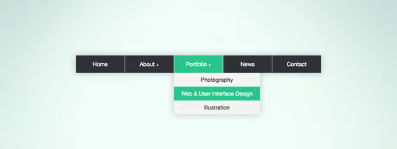
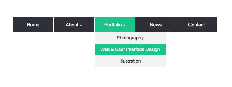
A flexible, multi-purpose navigation menu.
In this tutorial we will be creating a basic responsive navigation menu with dropdown using only HTML and CSS. Many navigation menus (especially responsive ones) are created using a combination of HTML, CSS and Javascript. This simple CSS only method will demonstrate that Javascript isn't always necessary!
The code we will create includes only the most essential CSS required for structure and basic styling. This makes it much easier to follow and understand the purpose of each line of code. It also means that the end product is primed and ready for your unique customization.
A Quick Message
Big thanks to the commenters that informed us of an issue this code was having on mobile devices! We have now amended the code using the checkbox method found here: http://bit.ly/1pMflzW as suggested by Sean Savoie.
The HTML
As you can see I have declared the HTML5 doctype, and included the basic page structure. The only content within the body tags is a nested unordered list. To demonstrate which top level links will have dropdowns, I have included a unicode down arrow (↓).
<!doctype html>
<html lang="en">
<head>
    <meta charset="UTF-8">
    <title>CSS Only Navigation Menu</title>
    <meta name="viewport" content="width=device-width, initial-scale=1">
    <link rel="stylesheet" href="style.css">
</head>
<body>
    <ul id="menu">
        <li><a href="#">Home</a></li>
        <li>
            <a href="#">About ↓</a>
            <ul class="hidden">
                <li><a href="#">Who We Are</a></li>
                <li><a href="#">What We Do</a></li>
            </ul>
        </li>
        <li>
            <a href="#">Portfolio ↓</a>
            <ul class="hidden">
                <li><a href="#">Photography</a></li>
                <li><a href="#">Web & User Interface Design</a></li>
                <li><a href="#">Illustration</a></li>
            </ul>
        </li>
        <li><a href="#">News</a></li>
        <li><a href="#">Contact</a></li>
    </ul>
</body>
</html>
The CSS
First of all, some basic styling to the ul and li elements to remove bullet points and other list styles. The inline-block and float:left attributes make the list display horizontally.
/*Strip the ul of padding and list styling*/
ul {
    list-style-type:none;
    margin:0;
    padding:0;
    position: absolute;
}
/*Create a horizontal list with spacing*/
li {
    display:inline-block;
    float: left;
    margin-right: 1px;
}
The following attributes are almost exclusively for aesthetic appeal. If you intend to style this menu to your liking then this is the section of code to fiddle about with.
/*Style for menu links*/
li a {
    display:block;
    min-width:140px;
    height: 50px;
    text-align: center;
    line-height: 50px;
    font-family: "Helvetica Neue", Helvetica, Arial, sans-serif;
    color: #fff;
    background: #2f3036;
    text-decoration: none;
}
/*Hover state for top level links*/
li:hover a {
    background: #19c589;
}
/*Style for dropdown links*/
li:hover ul a {
    background: #f3f3f3;
    color: #2f3036;
    height: 40px;
    line-height: 40px;
}
/*Hover state for dropdown links*/
li:hover ul a:hover {
    background: #19c589;
    color: #fff;
}
Next up, some styling for the dropdown links. The first class defines that the dropdown will not be visible by default. And the final class says that the dropdown element will become visible on top level link hover.
/*Hide dropdown links until they are needed*/
li ul {
    display: none;
}
/*Make dropdown links vertical*/
li ul li {
    display: block;
    float: none;
}
/*Prevent text wrapping*/
li ul li a {
    width: auto;
    min-width: 100px;
    padding: 0 20px;
}
/*Display the dropdown on hover*/
ul li a:hover + .hidden, .hidden:hover {
    display: block;
}
The navigation menu is ready for desktop use now, however we should also include some love for mobile users. Using a media query I target devices with a max width of 760px and make a few changes to the code.
/*Responsive Styles*/
@media screen and (max-width : 760px){
    /*Make dropdown links appear inline*/
    ul {
        position: static;
        display: none;
    }
    /*Create vertical spacing*/
    li {
        margin-bottom: 1px;
    }
    /*Make all menu links full width*/
    ul li, li a {
        width: 100%;
    }
}
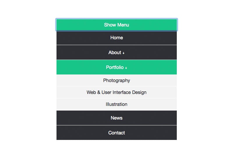
Optional Final Step
Space is limited on mobile devices, so it would be cool if we also had a button prompting mobile users to click a button before displaying the whole menu. To do this a couple of lines of code to the HTML where you want the button to appear.
<label for="show-menu" class="show-menu">Show Menu</label>
<input type="checkbox" id="show-menu" role="button">
Add the following code into the CSS anywhere outside the media query:
/*Style 'show menu' label button and hide it by default*/
.show-menu {
    font-family: "Helvetica Neue", Helvetica, Arial, sans-serif;
    text-decoration: none;
    color: #fff;
    background: #19c589;
    text-align: center;
    padding: 10px 0;
    display: none;
}
/*Hide checkbox*/
input[type=checkbox]{
    display: none;
}
/*Show menu when invisible checkbox is checked*/
input[type=checkbox]:checked ~ #menu{
    display: block;
}
And this code within the media query:
    /*Display 'show menu' link*/
    .show-menu {
        display:block;
    }
Complete Code
HTML:
<!doctype html>
<html lang="en">
<head>
    <meta charset="UTF-8">
    <title>CSS Only Navigation Menu</title>
    <meta name="viewport" content="width=device-width, initial-scale=1">
    <link rel="stylesheet" href="style.css">
</head>
<body>
    <label for="show-menu" class="show-menu">Show Menu</label>
    <input type="checkbox" id="show-menu" role="button">
        <ul id="menu">
        <li><a href="#">Home</a></li>
        <li>
            <a href="#">About ↓</a>
            <ul class="hidden">
                <li><a href="#">Who We Are</a></li>
                <li><a href="#">What We Do</a></li>
            </ul>
        </li>
        <li>
            <a href="#">Portfolio ↓</a>
            <ul class="hidden">
                <li><a href="#">Photography</a></li>
                <li><a href="#">Web & User Interface Design</a></li>
                <li><a href="#">Illustration</a></li>
            </ul>
        </li>
        <li><a href="#">News</a></li>
        <li><a href="#">Contact</a></li>
    </ul>
</body>
</html>
CSS:
/*Strip the ul of padding and list styling*/
ul {
    list-style-type:none;
    margin:0;
    padding:0;
    position: absolute;
}
/*Create a horizontal list with spacing*/
li {
    display:inline-block;
    float: left;
    margin-right: 1px;
}
/*Style for menu links*/
li a {
    display:block;
    min-width:140px;
    height: 50px;
    text-align: center;
    line-height: 50px;
    font-family: "Helvetica Neue", Helvetica, Arial, sans-serif;
    color: #fff;
    background: #2f3036;
    text-decoration: none;
}
/*Hover state for top level links*/
li:hover a {
    background: #19c589;
}
/*Style for dropdown links*/
li:hover ul a {
    background: #f3f3f3;
    color: #2f3036;
    height: 40px;
    line-height: 40px;
}
/*Hover state for dropdown links*/
li:hover ul a:hover {
    background: #19c589;
    color: #fff;
}
/*Hide dropdown links until they are needed*/
li ul {
    display: none;
}
/*Make dropdown links vertical*/
li ul li {
    display: block;
    float: none;
}
/*Prevent text wrapping*/
li ul li a {
    width: auto;
    min-width: 100px;
    padding: 0 20px;
}
/*Display the dropdown on hover*/
ul li a:hover + .hidden, .hidden:hover {
    display: block;
}
/*Style 'show menu' label button and hide it by default*/
.show-menu {
    font-family: "Helvetica Neue", Helvetica, Arial, sans-serif;
    text-decoration: none;
    color: #fff;
    background: #19c589;
    text-align: center;
    padding: 10px 0;
    display: none;
}
/*Hide checkbox*/
input[type=checkbox]{
    display: none;
}
/*Show menu when invisible checkbox is checked*/
input[type=checkbox]:checked ~ #menu{
    display: block;
}
/*Responsive Styles*/
@media screen and (max-width : 760px){
    /*Make dropdown links appear inline*/
    ul {
        position: static;
        display: none;
    }
    /*Create vertical spacing*/
    li {
        margin-bottom: 1px;
    }
    /*Make all menu links full width*/
    ul li, li a {
        width: 100%;
    }
    /*Display 'show menu' link*/
    .show-menu {
        display:block;
    }
}
Conclusion & Live Demo
This code should work just fine in modern browsers, and doesn't rely on any javascript which can slow down page load times. Be sure to check out the live demo and use the code however you like!
Pre-Coded Resources
Love the tutorial but still want everything nicely packaged? We've got a few resources for you then.
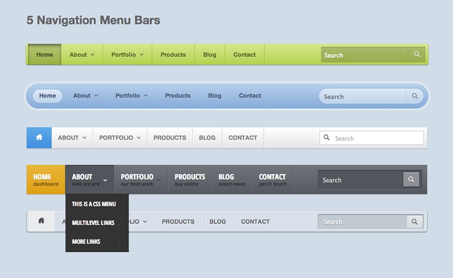

5 CSS Navigation Menu Bars
This premium pack includes 5 unique navigation menu bar designs that can be easily implemented into your existing design concepts of coded projects.
View Resource >

Flat CSS3 Menu Bars
This premium pack contains 2 stylish web navigation menus, fully coded using HTML5 and CSS3. They're very modern and easily to edit and implement into your designs.
View Resource >

Pretty CSS3 Menu Bars
This premium pack contains 2 super sleek web navigation menus, fully coded using HTML5 and CSS3. Also included in the package is the original .psd source file for your design concepts.
View Resource >


Comments