

by Tony Thomas
August 06, 2014
Tony creates pixel-perfect UI kits & icons. His pug, Wednesday, is Medialoot's beloved mascot.
How to Code a Homepage Template with HTML5 and CSS3
It's pretty easy and doesn't take too long
This tutorial has been created to guide you through the process of converting one of our most popular PSD homepage templates on Medialoot into fully coded HTML and CSS.
What We're Coding
Let's take a look at our design, we will be working with a Medialoot PSD template called Simply. Simply is a minimal homepage design with subtle colours and strong headline typography. If you aren't a Medialoot member it is still possible to follow along with the tutorial, click the preview below for a full resolution image to work from: 
Understanding the Design
As you can probably see, Simply is a full width homepage design and has 7 distinct sections. We can use these sections to visually break the whole page down into a series of more manageable chunks to work with.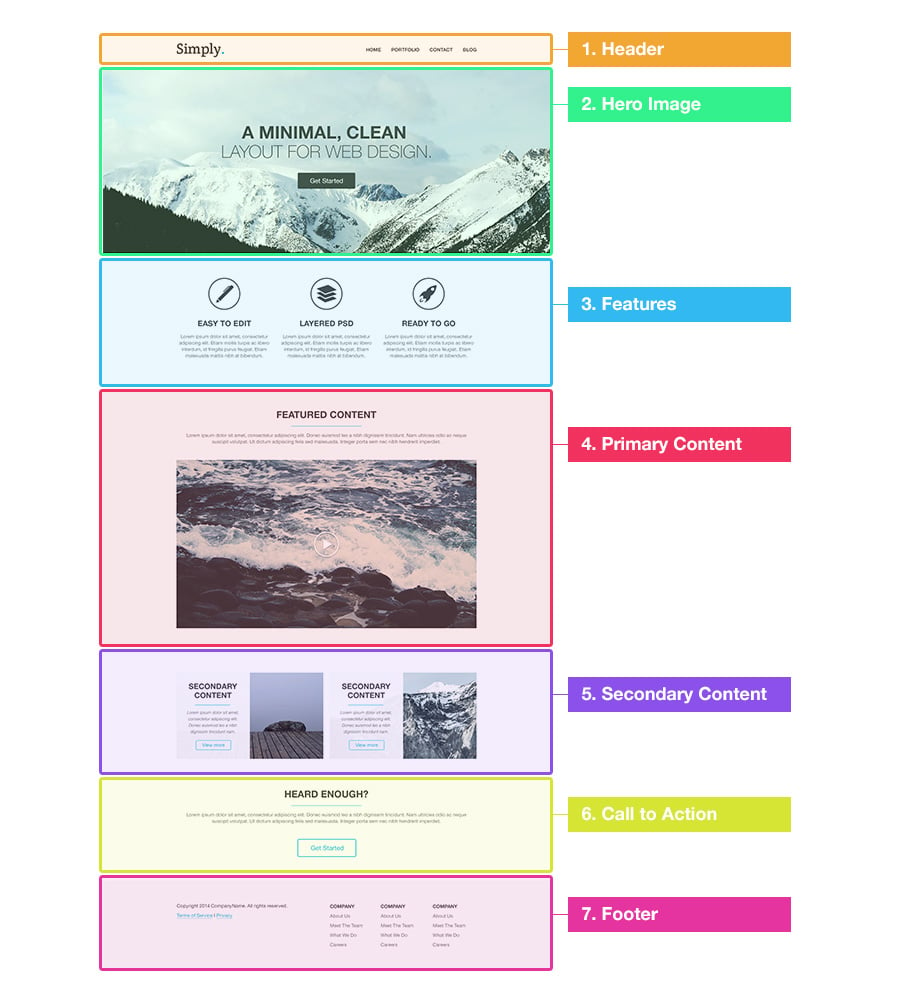
Setting up the Folder Structure
The first thing we need to do is create the folder structure for the project. It is fairly straightforward, all we need is an HTML file, a folder for images and a CSS file. So create a containing folder called 'simply' and two sub-folders called 'images' and 'css'. Then using a code editor create a new blank html file and save it as index.html.
Exporting the Assets
Almost all of this particular design can be easily recreated using just HTML and CSS, however we will need to extract a handful of image assets from the .psd file. To export the individual assets, open the Simply design file in Photoshop and locate the layer for the asset that you want to export. Then hold down the Alt key and click the layer visibility icon. 
This will show only the selected layer, you can now go to the Image menu and select Trim... to trim the transparent pixels.
Select the Save for Web... option under the File menu and save the photographs as JPG files and any icons or images with transparency as PNG files.
Rinse. Repeat.
Here is a list of all the assets required, their filenames, extensions and image resolutions required:
- hero.jpg - 2000 x 697 px
- features-icon-1.png - 100 x 100 px
- features-icon-2.png - 100 x 100 px
- features-icon-3.png - 100 x 100 px
- video-placeholder.jpg - 940 x 527 px
- article-image-1.jpg - 460 x 270 px
- article-image-2.jpg - 460 x 270 px
Click here to download all of the image assets pre-exported
Setting up the HTML File
Open up the index.html file in your text editor and add the following code:
<!DOCTYPE HTML>
<html>
<head>
    <meta http-equiv="Content-Type" content="text/html; charset=utf-8">
    <title>Simply</title>
    <!--[if lt IE 9]>
    <script src="http://html5shiv.googlecode.com/svn/trunk/html5.js"></script>
    <![endif]-->
</head>

<body>

</body>
</html>
This is the most basic skeleton that all html files need. It defines the document type (HTML5), the character set (UTF-8) and the title of the page.
In addition to the basic skeleton, I have also included a script called HTML5Shiv using a conditional comment 'if lt IE 9'. This will enable the use of semantic HTML5 tags such as <header>, <article> and <footer> in older versions of Internet Explorer that don't natively support HTML5.
Dissecting Our Design
As we have already split the design up into 7 distinct sections, we can now take this a step further and visually break it down into the basic structure that we will use for the HTML. Here is an image demonstrating how to do this: 
You will notice that not every single element has been labelled, just the most important structural elements. The rest can be added later along with the content.
So let's put that structure into our HTML file, in-between the <body> tags:
<!DOCTYPE HTML>
<html>
<head>
    <meta http-equiv="Content-Type" content="text/html; charset=utf-8">
    <title>Simply</title>
    <!--[if lt IE 9]>
    <script src="http://html5shiv.googlecode.com/svn/trunk/html5.js"></script>
    <![endif]-->
</head>

<body>
    <header>
        <h1></h1>
        <nav></nav>
    </header>

    <div id="hero-image">
        <h2></h2>
        <a></a>
    </div>

    <div id="features">
        <ul>
            <li></li>
            <li></li>
            <li></li>
        </ul>
    </div>

    <div id="primary-content">
        <article></article>
    </div>

    <div id="secondary-content">
        <article></article>
        <article></article>
    </div>

    <div id="cta">
    </div>

    <footer>
        <div id="footer-info"></div>
        <div id="footer-links">
            <ul></ul>
            <ul></ul>
            <ul></ul>
        </div>
    </footer>

</body>
</html>
Because the design has a width of 960px, we will also need to insert a wrapper into each section. This is done using a container div with a class of 'wrapper':
<!DOCTYPE HTML>
<html>
<head>
    <meta http-equiv="Content-Type" content="text/html; charset=utf-8">
    <title>Simply</title>
    <!--[if lt IE 9]>
    <script src="http://html5shiv.googlecode.com/svn/trunk/html5.js"></script>
    <![endif]-->
</head>

<body>
    <header>
        <div class="wrapper">
            <h1></h1>
            <nav></nav>
        </div>
    </header>

    <div id="hero-image">
        <div class="wrapper">
            <h2></h2>
            <a></a>
        </div>
    </div>

    <div id="features">
        <div class="wrapper">
            <ul>
                <li></li>
                <li></li>
                <li></li>
            </ul>
        </div>
    </div>

    <div id="primary-content">
        <div class="wrapper">
            <article></article>
        </div>
    </div>

    <div id="secondary-content">
        <div class="wrapper">
            <article></article>
            <article></article>
        </div>
    </div>

    <div id="cta">
        <div class="wrapper">
        </div>
    </div>

    <footer>
        <div class="wrapper">
            <div id="footer-info"></div>
            <div id="footer-links">
                <ul></ul>
                <ul></ul>
                <ul></ul>
            </div>
        </div>
    </footer>

</body>
</html>
Adding The Content
We can now add the content from the design into the HTML. We will also be adding more tags for minor elements such as paragraphs, headers, links, list items and anything that hasn't already been added:
Section 1: Header
The header consists of a logo and navigation menu. A <h1> tag is used for the logo and a span with a class of 'color' will allow us to set a different color for the full stop using CSS later. The navigation menu is a simple unordered list <UL> with 4 list items <li>, wrapped in the semantic HTML5 <nav> tags.
<header>
    <div class="wrapper">
        <h1>Simply<span class="color">.</span></h1>
        <nav>
            <ul>
                <li><a href="#">Home</a></li>
                <li><a href="#">Portfolio</a></li>
                <li><a href="#">Contact</a></li>
                <li><a href="#">Blog</a></li>
            </ul>
        </nav>
    </div>
</header>
Section 2: Hero Image
The hero banner image is a simple div with the headline text in a <h2> and button link
<div id="hero-image">
    <div class="wrapper">
        <h2><strong>A Minimal, clean</strong><br/>
        layout for web design.</h2>
        <a href="#" class="button-1">Get Started</a>
    </div>
</div>
Section 3: Features
The 3 feature sections are each a list item in an unordered list, using CSS we will float the list items left to display them horizontally. To prevent other elements being affected by the floating we will also need a div with the class 'clear' and in the CSS later the class '.clear' will have the attribute 'clear:both'.
<div id="features">
    <div class="wrapper">
        <ul>
            <li class="feature-1">
                <h4>Easy to Edit</h4>
                <p>Lorem ipsum dolor sit amet, consectetur adipiscing elit. Etiam mollis turpis ac libero interdum, id fringilla purus feugiat. Etiam malesuada mattis nibh at bibendum.</p>
            </li>
            <li class="feature-2">
                <h4>Layered PSD</h4>
                <p>Lorem ipsum dolor sit amet, consectetur adipiscing elit. Etiam mollis turpis ac libero interdum, id fringilla purus feugiat. Etiam malesuada mattis nibh at bibendum.</p>
            </li>
            <li class="feature-3">
                <h4>Ready to Go</h4>
                <p>Lorem ipsum dolor sit amet, consectetur adipiscing elit. Etiam mollis turpis ac libero interdum, id fringilla purus feugiat. Etiam malesuada mattis nibh at bibendum.</p>
            </li>
            <div class="clear"></div>
        </ul>
    </div>
</div>
Section 4: Primary Content
The primary content section is very simple and uses an <img> tag for the video placeholder image.
<div id="primary-content">
    <div class="wrapper">
        <article>
            <h3>Featured Content</h3>
            <p>Lorem ipsum dolor sit amet, consectetur adipiscing elit. Donec euismod leo a nibh dignissim tincidunt. Nam ultricies odio ac neque suscipit volutpat. Ut dictum adipiscing felis sed malesuada. Integer porta sem nec nibh hendrerit imperdiet. </p>
            <a href="#"><img src="images/video-placeholder.jpg" alt="video placeholder" /></a>
        </article>
    </div>
</div>
Section 5: Secondary Content
Similarly to the features section, we are floating each <article> left to display them horizontally. You will probably notice in this section that we have used some inline styles. I would not normally recommend this, but in this instance the background image for the articles would be classed as content rather than styling so it belongs in the HTML not CSS.
<div id="secondary-content">
    <div class="wrapper">
        <article style="background-image: url('images/article-image-1.jpg');">
            <div class="overlay">
                <h4>Secondary Content</h4>
                <p><small>Lorem ipsum dolor sit amet, consectetur adipiscing elit. Donec euismod leo a nibh dignissim tincidunt nam.</small></p>
                <a href="#" class="more-link">View more</a>
            </div>
        </article>
        <article style="background-image: url('images/article-image-2.jpg');">
            <div class="overlay">
                <h4>Secondary Content</h4>
                <p><small>Lorem ipsum dolor sit amet, consectetur adipiscing elit. Donec euismod leo a nibh dignissim tincidunt nam.</small></p>
                <a href="#" class="more-link">View more</a>
            </div>
        </article><div class="clear"></div>
    </div>
</div>
Section 6: Call to Action
Another straightforward section featuring just a heading 3, paragraph and button link.
<div id="cta">
    <div class="wrapper">
        <h3>Heard Enough?</h3>
        <p>Lorem ipsum dolor sit amet, consectetur adipiscing elit. Donec euismod leo a nibh dignissim tincidunt. Nam ultricies odio ac neque suscipit volutpat. Ut dictum adipiscing felis sed malesuada. Integer porta sem nec nibh hendrerit imperdiet. </p>
        <a href="#" class="button-2">Get Started</a>
    </div>
</div>
Section 7: Footer
The footer is divided into two columns, the 'footer-info' column and the 'footer-links' column. The 'footer-links' column is then sub-divided into 3 columns using unordered lists.
<footer>
    <div class="wrapper">
        <div id="footer-info">
            <p>Copyright 2014 CompanyName. All rights reserved.</p>
            <p><a href="#">Terms of Service</a> I <a href="#">Privacy</a></p>
        </div>
        <div id="footer-links">
            <ul>
                <li><h5>Company</h5></li>
                <li><a href="#">About Us</a></li>
                <li><a href="#">Meet The Team</a></li>
                <li><a href="#">What We Do</a></li>
                <li><a href="#">Careers</a></li>
            </ul>
            <ul>
                <li><h5>Company</h5></li>
                <li><a href="#">About Us</a></li>
                <li><a href="#">Meet The Team</a></li>
                <li><a href="#">What We Do</a></li>
                <li><a href="#">Careers</a></li>
            </ul>
            <ul>
                <li><h5>Company</h5></li>
                <li><a href="#">About Us</a></li>
                <li><a href="#">Meet The Team</a></li>
                <li><a href="#">What We Do</a></li>
                <li><a href="#">Careers</a></li>
            </ul>
        </div>
        <div class="clear"></div>
    </div>
</footer>
The next step is to link to some css files that we will be using. The first one is a css reset from Meyerweb that can be downloaded here: CSS Reset. Once it has been downloaded place it into the css folder and include this line of code in the <head> section of our HTML:
<link rel="stylesheet" type="text/css" href="css/reset.css">
Then we want to include a separate css file for our own custom styles. Create a new blank document with your text editor and save it as style.css, place it in the css folder and then include this line of code in the <head> section of the HTML (directly below the css reset line):
<link rel="stylesheet" type="text/css" href="css/style.css">
We will also be using a custom font from the Google Fonts library for the logo text. Including this line of code will allow us to use the 'Crete' font:
<link href='http://fonts.googleapis.com/css?family=Crete+Round' rel='stylesheet' type='text/css'>
Adding the Styles
Global Styles
Some styles such as the body, headings, paragraphs and links are global attributes that apply to the whole document, so we will define these first. Most of these attributes, such as colours and fonts are simply extracted from the PSD file. The width of the wrapper is 960 pixels minus 10 pixels padding on either size. And due to using a CSS reset, attributes such as strong and small will need to defined.
body {
    background-color: #fff;
    color: #777;
    font: normal 15px "Helvetica Neue", Arial, Helvetica, Geneva, sans-serif;
}
p {
    line-height: 20px;
    margin-bottom: 20px;
}
h1 {
    font-family: 'Crete Round', serif;
    font-weight: bold;
    color: #444;
    font-size: 45px;
    margin-bottom: 20px;
}
h2 {
    font-weight: 300;
    color: #444;
    font-size: 55px;
    text-transform: uppercase;
    text-align: center;
    margin-bottom: 20px;
}
h3 {
    font-size: 30px;
    color: #444;
    font-weight: bold;
    text-transform: uppercase;
    text-align: center;
    margin-bottom: 20px;
}
h4 {
    font-size: 24px;
    color: #444;
    font-weight: bold;
    text-transform: uppercase;
    margin-bottom: 20px;
}
h5 {
    font-size: 15px;
    color: #444;
    font-weight: bold;
    text-transform: uppercase;
}
a {
    text-decoration: none;
    color: #444;
}
a:hover {
    color: #02b8dd;
}
strong {
    font-weight: bold;
}
small {
    font-size: 13px;
    color: #777;
    font-style: italic;
}
.clear {
    clear: both;
}
.wrapper {
    margin: 0 auto;
    padding: 0 10px;
    width: 940px;
}
Section 1: Header
The <h1> styles position the logo text and the .color attribute defines the colour of the full stop in the logo. The navigation <ul> displays all of list items floating to the left.
header {
    height: 120px;
}
header h1 {
    float: left;
    margin-top: 32px;
}
header h1 .color {
    color: #02b8dd;
}
header nav {
    float: right;
}
header nav ul li {
    float: left;
    display: inline-block;
    margin-top: 50px;
}
header nav ul li a {
    color: #444;
    text-transform: uppercase;
    font-weight: bold;
    display: block;
    margin-right: 20px;
}
Section 2: Hero Image
The #hero-image class has a height which is actually less than the dimensions of the background image, this gives you a few pixels top and bottom to play with if minor changes are needed in the future, or if you are making your design responsive.
#hero-image {
    height: 580px;
    padding-top: 1px;
    background: #e8eced url('../images/hero.jpg') no-repeat center;
}
#hero-image h2 {
    margin: 180px 0 40px 0;
}
.button-1 {
    display: block;
    text-align: center;
    background: #444;
    border-radius: 3px;
    color: #fff;
    width: 180px;
    height: 50px;
    font-size: 20px;
    line-height: 50px;
    margin: 0 auto;
}
.button-1:hover {
    background-color: #02b8dd;
    color: #fff;
}
Section 3: Features
Each of the feature elements share the #features ul li attribute but the individual .feature-1, .feature-2 and .feature-3 attributes are unique to their respective elements and define different icons for each feature.
#features ul {
    margin: 80px 0;
}
#features ul li {
    width: 300px;
    padding-top: 140px;
    float: left;
    margin-right: 10px;
    text-align: center;
}
#features ul li.feature-1 {
    background: url('../images/features-icon-1.png') no-repeat top center;
}
#features ul li.feature-2 {
    background: url('../images/features-icon-2.png') no-repeat top center;
}
#features ul li.feature-3 {
    background: url('../images/features-icon-3.png') no-repeat top center;
}
Section 4: Primary Content
The heading 3 in this section is underlined and aligned to the center, which is customisation of the standard h3 defined in the global styles part of the CSS.
#primary-content {
    background-color: #f8fafa;
    padding: 60px 0;
    text-align: center;
}
#primary-content h3 {
    display: block;
    margin: 0 auto 20px auto;
    width: 400px;
    border-bottom: 1px solid #02b8dd;
    padding: 0 0 20px 0;
}
#primary-content a img {
    margin: 20px 0;
}
Section 5: Secondary Content
A first-child selector is used to place 20 pixels of margin on the first article only, and the .overlay class features a slightly transparent white background using rgba.
#secondary-content {
    padding: 60px 0;
    text-align: center;
}
#secondary-content article {
    width: 460px;
    height: 270px;
    float: left;
    background-color: #f5f5f5;
}
#secondary-content article:first-child {
    margin-right: 20px;
}
#secondary-content article .overlay {
    background: rgba(255, 255, 255, .95);
    height: 230px;
    width: 190px;
    padding: 20px;
}
article h4 {
    border-bottom: 1px solid #02b8dd;
    padding-bottom: 20px;
}
.more-link {
    border: 1px solid #02b8dd;
    color: #02b8dd;
    padding: 6px 20px;
    border-radius: 3px;
}
.more-link:hover {
    background-color: #02b8dd;
    color: #fff;
}
Section 6: Call to Action
We use the same custom styling for <h3> here and also define the styles for the outlined button and its hover state
#cta {
    padding: 60px 0;
    text-align: center;
}
#cta h3 {
    display: block;
    margin: 0 auto 20px auto;
    width: 400px;
    border-bottom: 1px solid #02b8dd;
    padding: 0 0 20px 0;
}
.button-2 {
    display: block;
    margin: 0 auto;
    border: 2px solid #02b8dd;
    color: #02b8dd;
    border-radius: 3px;
    width: 180px;
    height: 50px;
    font-size: 20px;
    line-height: 50px;
}
.button-2:hover {
    background-color: #02b8dd;
    color: #fff;
}
Section 7: Footer
We split the footer into two main columns with a float: left attribute on both #footer-info and #footer-links. And use the same method to split the #footer-links section into 3 horizontal unordered lists.
footer {
    padding: 60px 0;
    background-color: #f8fafa;
}
#footer-info {
    width: 380px;
    float: left;
    margin-top: 10px;
}
#footer-links {
    width: 520px;
    float: right;
}
#footer-links ul {
    width: 150px;
    float: left;
    margin-left: 20px;
}
#footer-links ul li {
    margin: 10px 0;
}
Conclusion
And there we have it! By breaking the design down into sections and visualising the structure before we start coding, it is surprisingly straightforward to code a template using HTML5 and CSS3.
Don't forget that you can download the Simply template here:

Simply - Minimal Website Template
Simply is a minimal, flat single page PSD template with subtle colors and strong headline typography. This layout is designed with agencies in mind, and features a large clean header with navigation, top banner, list of features, content sections and footer.
Download


Comments