
Great Examples Of Icons Used In Website Design
Here at MediaLoot we love icons. I'm sure you do too. Of course icons can be used in a variety of situations, from applications to print design and of course web-design. There are some things to keep in mind when using icons in web-design projects though. Too many attention-grabbing icons can really distract users and ruin the experience. And of course the opposite is also true: some designs could be improved by using some choice icons in particular places like the navigation or pricing tables.
the content.Let's have a look at some sites that make great use of icons.
The Prayer Engine ↓
 I love the Prayer Engine site design. Ok I admit it, I'm a huge fan of minimalist and 'to the point' designs but I think what caught my attention was the flat icons they used on their homepage. Each icon represents the title below it without looking cliché.
Mocksup ↓
 The Mocksup homepage features some great icons that describe what each paragraph is about. The 'build a painless prototype' paragraph has a bottle of pills/painkillers on the left. What a great and unique idea!
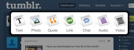
Tumblr Dashboard ↓
 It doesn't get any clearer than the Tumblr dashboard icons (you need a Tumblr account to see this). We all know that people don't read but instead scan web pages. It is so obvious what those icons mean that the text below them is almost unnecessary.
Marketcircle Blog ↓
 On the Marketcircle Blog, each category is represented by an icon so users can easily find the posts in the categories they're interested in. I find that's a very nice touch.
Jonas Lekevicius ↓
 Now this is a very unique design. I love how each link in the sidebar has an icon and distinct color assigned to it when you mouse over the links.
FreelanceFolder ↓
 I may be a little biased towards FreelanceFolder since I used to run this site, but Mason did a great job with the nav bar using a nice subtle letterpress effect.
CafePoint ↓
 The CafePoint website features some great hand-drawn icons. Each representing the heading or section it's associated with. I like how the hand-drawn style is consistent - even the checkmark submit button in the newsletter subscription section has this hand-drawn feel.
Facebook ↓
 While I'm not a huge fan of the most recent Facebook 'realign', I have to give them props for using icons that are clear, simple and to the point. So effective in fact that in many cases a description or text is not needed. The icons alone provide enough information for users to perform actions such as editing content, posting links and sharing stuff.
And Here Are Some More Examples


Comments