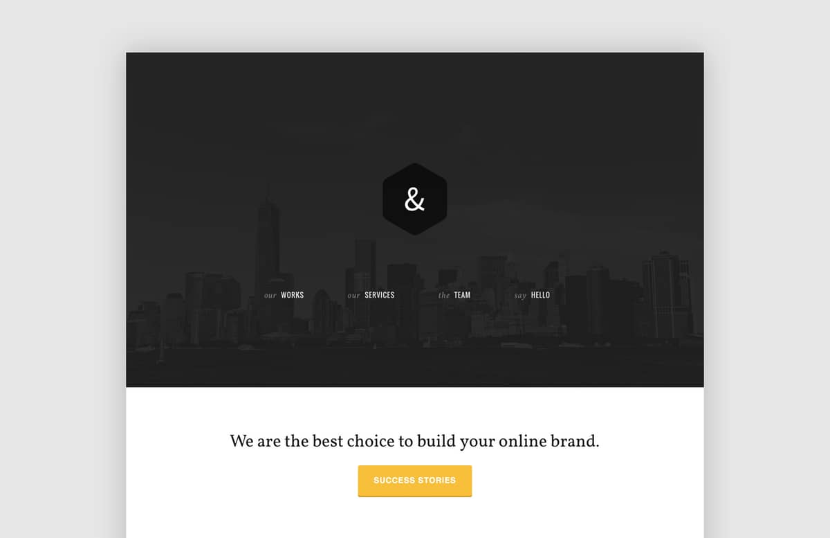
AmpPortfolio - Responsive HTML5/CSS3 theme for agencies
Today’s resource is a minimal responsive (Mobile first) theme for agencies and small companies. The user experience is enriched by some subtle CSS3 animations. You can add your own logo and images simply by replacing them inside the img folder. For the works gallery, feel free to link each work to an external page (e.g. a Behance project page). Alternatively you may install a jQuery plugin to link to a modal window with bigger versions of each images.
The theme is retina ready (remember to add 2 versions of the logo, one standard and one @2x size). For some icons (see services) I used some .svg icons from Tony’s Vector Outlined SEO icons set.
Here is a Live demo.
Built using SASS
Having built the theme with SASS and Compass, it’s super easy to customise it. I used variables for colours and fonts. To change the color theme, just replace the variables inside the _variables.scss partial. Same thing for the fonts (remember also to change the @import url inside style.scss to import Google fonts).
Paid License
By purchasing or downloading this item you are agreeing to abide by all terms and conditions laid out in the MediaLoot License Agreement. View the full license >
All Tags
Professional Customization
Order Custom Now — $Upgrade to PRO?
The PRO version has way more benefits. Ongoing support, updates, commercial license, and more.
- 100% money-back guarantee
- Lifetime download access
- No-attribution commercial use


Comments