

by Natalie Miller
April 04, 2010
Natalie is one of the co-founders of Medialoot. She's mainly responsible for making sure the website is running smoothly, and she's probably the one who has helped you out via email too.
How To Create A Colorful Business Card Template in Illustrator CS4 (+ free template)
In this tutorial we're going to be designing a bright, colorful and "happy" business card design from scratch in Adobe Illustrator CS4.
The Outcome
The outcome of this business card uses a similar style to that I used in a recent brochure design I completed for MediaLoot; feel free to download it as a great companion to this business card!

The Resources
We don't need many resources in this tutorial, as we'll be making almost everything from scratch. However, to make things easier on your end, here are a couple of things that may come in handy!- Helvetica Font
- Helvetica Neue Font
- Illustrator Color Swatch (w/colors used in this tutorial)
- Source File (feel free to use for your company!)
Step 1
The first step with any design is to sketch. So grab a pad and pen and get sketching! I roughed out a few different ideas, and have decided I want to go with the bottom one, both the front and back design.
Step 2
Open up Adobe Illustrator and create a new document. The size, really, is completely up to you. I'm going to use one of the many "standard" business card sizes; 55x85mm. Use a 3mm bleed (check with your printers, they may want more than this), and set your Raster Effects to 300ppi. If you're using Adobe Illustrator CS4, you could use the handy "Number of Artboards" feature, which basically allows you to have two artboards side-by-side; in this case, the front and back of your card.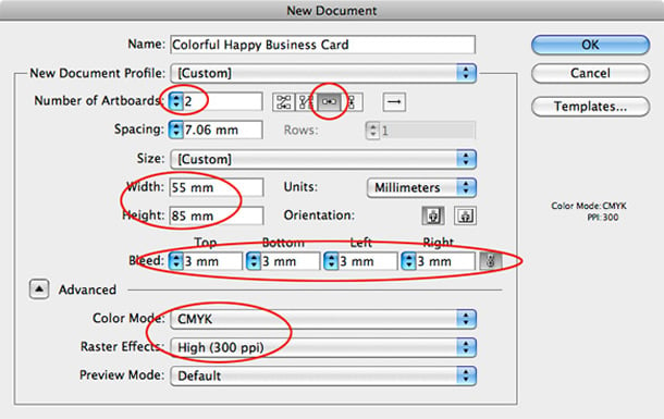 Once you have created your artboards, save the document. This is a ridiculous step, but worth doing. You could, if you haven't already, save this set-up as a template so you don't need to keep recreating artboards and new documents everytime you design a new business card.

Step 3
It's time to get to work on our design. Grab the the Rectangle Tool and drag out a shape to fill the entire area of your business card, from bleed to bleed. Remove the stroke and fill the shape with any color.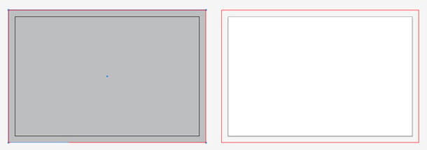 We're going to add a subtle and slick-looking gradient to the design now. It's not going to be anything to overpowering, just something nice and simple to add that extra "oomph" to our final design. To apply a gradient to the shape, you simply need to click on the "gradient" in the gradient window/palette.
 Once you've clicked on this, you'd have noticed it automatically applies a black to white gradient to our shape. To change this, simply drag a color swatch of your choice onto the two ends of the gradient level. I've used two very light grays, and changed the gradient type to radial.
 This has added a lovely subtle gradient to our design. Copy the rectangle by hitting Cmd+C, and then paste it in place by hitting Cmd+F (this literally does just paste the shape in place). Use the Shift+Cursor-Keys to shift the shape along to the second artboard (the back of our business card design). This saves us creating the shape again.

Step 4
With this done, it's time to start creating the colorful and "happy" stripes. Grab the Rectangle Tool again and click somewhere in your document. Enter the measurements 10mm by 61mm and click OK. Change the color of your shape to something clear and obvious, and move the shape to the left side of your first artboard, making sure it's touching the edge of your artboard (not your bleed).
 The reason we haven't yet put it against our artboards bleed is because we want the visible shape (once the cards have been printed) to measure 1cm wide, the same length of that used in my brochure design. Using the Selection Tool, make the shape larger by stretching the left side of it, making it touch the bleed.
 Copy and paste the shape, and whilst using the Direct Selection Tool and holding the shift-key, rotate it.
 Move and stretch the shape so it is touching all three (left, bottom and right) sides of the bleed. Make sure the visible area within the actual artboard is only 1cm wide.
 Copy the left shape once again, and position it on the other side of the card.
 Select the green shape, and reduce the length of it, so it's somewhere around half way of the entire length of our artboard - this doesn't have to be completely accurate, although guides should make that possible!
 Copy that shape, and move it to the other side of our artboard. Change the color of our left shapes to one color, and the color of our right shapes to another - colors aren't important yet as we will be changing those soon!
 Click on the background of our business card (you can do this on both artboards) and go to Object > Lock > Selection. This will stop them from getting in the way. Select the shapes on our left side by dragging over and making sure both of them are in your selection. In the Pathfinder Window (Window > Pathfinder) select Unite. This will merge the two shapes into one. Repeat the step to the shapes on the right side.
 Create a new shape using the same techniques we have been using, and fill it with a different color. Overhead the artboards, you should find an "Align to Artboard" button, click on this, and then click on Horizontal Align Center. This will center your shape, allowing everything to be in the perfect position.

Step 5
It's time to add some of our own color and get rid of these randomly selected ones that we have been using on a temporary basis. You can either choose your own color scheme, or if you want to use the colors I am going to use, you can download my color swatch palette using the link at the top of this post under the resources section. Load it up by double-clicking on the .AI file, or in your swatch palette, click on "Other Library". Once you've loaded it up, you can start coloring your shapes by clicking on the shape and then on a swatch - simple! Whilst we're in the mood of creating rectangles and coloring, repeat the previous few steps to create the shapes on the other artboard in our document, and color them.

Step 6
With that done, we can now concentrate on some typography. For this business card, I'm going to use Helvetica and Helvetica Neue, fonts that most of you probably already have on your system.. If not, there are links at the top of this page to where you can purchase them for a great price. Select the Type Tool and drag out a box on the front of your business card. Fill it with your company name and a slogan. Alternatively, you may want to place your logo by going to File > Place. Start playing around with your text. I've used various styles, colors and sizes. My company name, "MediaLoot", uses Helvetica Bold, with a size ranging from 24-28pt. My slogan, "This Business Card Is Slick, Baby!", uses Helvetica Neue Medium with a size set to 8pt, a leading of 0.01pt, and "All Caps" selected. I changed the color to green to match the centre rectangle shape, making the design easy on the eyes. Make sure you align your typography well!

Step 7
Repeat the previous couple of steps on the other artboard containing the back of your business card. Remember to play around with different sizes and leadings. I used a combination of Helvetica Bold, Helvetica Neue Regular and Helvetica Neue Medium. Using the Line Segment Tool, create a line to finish off the back of our card. Fill it with a light gray 0.25px stroke.

Step 8
If there's one thing I'm asked a lot, it's how to set up a file for Spot UV printing. It's actually very easy. When the file is sent to press, a file is seperated into four images: one containing cyan, one for magenta, one for yellow and one for "K", which stands for "key", meaning black (this was done to avoid confusing between black and blue). Another image is created if Spot UV is required, and is usually seen as a bright, vivid spot color on screen that isn't used elsewhere in the design (it is typically 100% magenta, but as we've used a bright pink in this design we won't be using that this time). This color is then seperated from the others, and is printed with Spot UV, instead of actual Pantone color. I want to add a Spot UV finish to all of the text and colored rectangles on my card, so virtually everything minus the background. Select everything you want to have a Spot UV coat by clicking on one object, and holding shift and clicking on another object. Repeat this step until you have every object selected. Go to File > Copy. Make a new layer (something most people don't do in Illustrator) and rename it to "SPOT UV". Making sure you're on the new layer, go to Edit > Paste in Place. With the new artwork still selected, go to Object > Group, and change the color of the grouped items to a Pantone color.
 It may look like we've just ruined our work, but underneath we have reserved all of those lovely colors. The purple on your screen will be printed as a clear Spot UV over everything else which has previously been printed (CMYK), leaving you with a gorgeous shiny metallic surface.
Export your file as a high-quality PDF, and you're done!
It may look like we've just ruined our work, but underneath we have reserved all of those lovely colors. The purple on your screen will be printed as a clear Spot UV over everything else which has previously been printed (CMYK), leaving you with a gorgeous shiny metallic surface.
Export your file as a high-quality PDF, and you're done!
The Outcome
Comments