
by Tony Thomas
June 06, 2012
Tony creates pixel-perfect UI kits & icons. His pug, Wednesday, is Medialoot's beloved mascot.
5 Practical Ways to Replace Images with CSS3
Every web designer and developer should be aware of CSS3 and all of it's fantastic new properties that make life easier for web professionals. But we may not be truly making the most of the technology that is available to us.
For example a lot of designers and developers still rely very heavily on images for web elements, when they code their websites. This may be because it seems quick and easy, or it's perhaps just the way that we are all used to doing things, afterall using images was once the only way to get gradients, shadows, rounded corners and other simple effects on the web. But there are now very strong arguments to switch over to CSS3. For example reduced page load times, better scalability, and the flexibility to adjust dimensions and attributes without having to launch an image editor. Browser compatibility with CSS3 is constantly improving, and more people are also starting to accept that if users have out-dated browsers, they simply aren't going to be able to get the best experience on the web.1. Buttons
Buttons are probably the most common of all web elements, and they usually consist of a rectanglular shape, with some label text on it. Common attributes for the base shape are rounded corners, and a linear gradient. Here is an example of how we can use CSS3 properties to create a simple button: ? The code for the button:
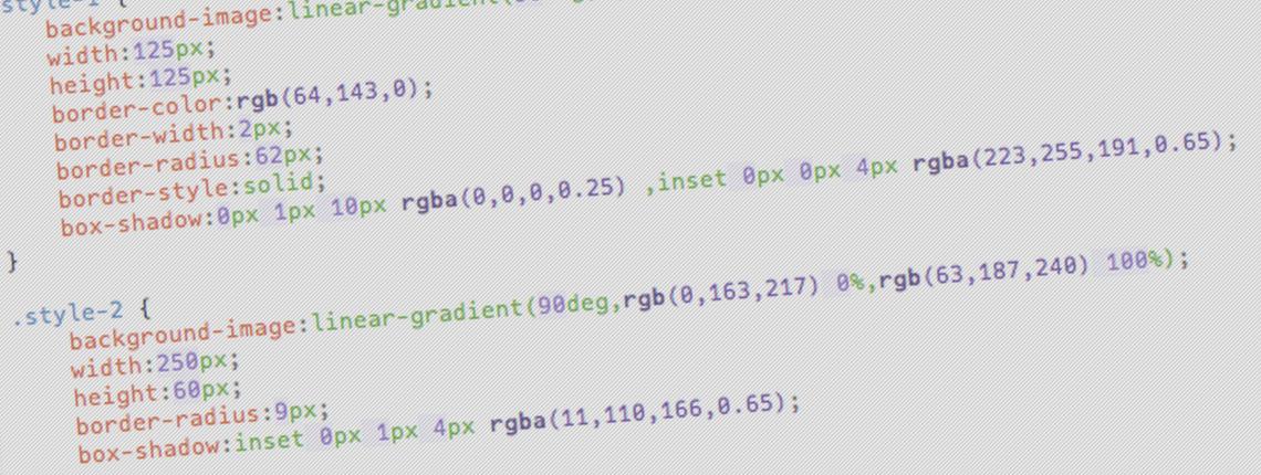
background-image:linear-gradient(90deg,rgb(0,163,217) 0%,rgb(63,187,240) 100%);
width:250px;
height:60px;
border-radius:9px;
box-shadow:inset 0px 1px 4px rgba(11,110,166,0.65);2. Badges
An element that is very rarely created using CSS is the badge. Badges are usually used to attract your visitors attention to some sort of offer or deal, and they became very popular during the dreaded ‘Web 2.0' phase. If used tastefully though, the badge can be a useful element to have on your page, and can be quite easily without the use of images. ?
The code for the badge:
background-image:linear-gradient(90deg,rgb(84,169,13) 0%,rgb(179,235,102) 100%);
width:125px;
height:125px;
border-color:rgb(64,143,0);
border-width:2px;
border-radius:62px;
border-style:solid;
box-shadow:0px 1px 10px rgba(0,0,0,0.25) ,inset 0px 0px 4px rgba(223,255,191,0.65);font-family:"Helvetica Neue";
font-size:32px;
font-weight:bold;
color: #ffffff;
text-align:center;
text-shadow:0px -1px 1px rgb(64,143,0);3. Content Boxes
Content boxes, such as those that can be seen on the Apple homepage would be simple to replace with pure CSS versions, as demonstrated below: The code for the box:
background-image:linear-gradient(90deg,rgb(227,227,227) 0%,rgb(252,252,252) 100%);
width:280px;
height:150px;
border-radius:5px;
box-shadow:0px 1px 2px rgba(0,0,0,0.5) ,inset 0px 1px 1px rgb(255,255,255);
4. Form Elements
Form elements are perfect candidates for getting a CSS3 make-over. It used to be difficult to style form elements consistently between browsers, usually relying on images. But now that most browsers support CSS3 styling on form elements, we can achieve results like this completely hassle (and image) free. ?
The code for the default state is:
background-color: #ffffff;
border-color:rgb(182,182,182);
border-width:1px;
border-style:solid;
box-shadow:0px 1px 0px 0px rgba(255,255,255,0.5) ,inset 0px 1px 4px 0px rgba(0,0,0,0.4);background-color: #ffffff;
border-color:rgb(38,147,255);
border-width:1px;
border-style:solid;
box-shadow:0px 0px 5px 0px rgba(77,210,255,0.75) ,0px 1px 0px 0px rgba(255,255,255,0.5) ,inset 0px 1px 4px 0px rgba(0,0,0,0.4);5. Loading Bars
Using CSS3 will create much more flexible progress bars than images would, and updating the progress is a simple as modifying the width attributes. The code for the container:
background-image:linear-gradient(90deg,rgb(255,255,255) 0%,rgb(231,231,231) 50%,rgb(255,255,255) 50%,rgb(255,255,255) 99%,rgb(255,255,255) 100%);
width:500px;
height:15px;
box-shadow:0px 1px 3px rgba(0,0,0,0.4);background-image:linear-gradient(-90deg,rgb(Infinity,Infinity,Infinity) 0%,rgb(157,184,207) 50%,rgb(109,134,160) 50%,rgb(-Infinity,-Infinity,-Infinity) 100%);
width:370px;
height:15px;
box-shadow:inset 0px 0px 2px rgb(46,50,61);