
by Cecilia Razak
February 08, 2017
Once a marketing guru at an agency, Cecilia has combined her love for content, design, and cute dogs into a new dog walking startup called Spotwalk.
Designing for Usability When You're a Novice Designer
Updated useful tips to help anyone create a good user interface
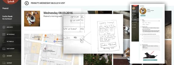
I’m not a designer. My aesthetic and usability instincts are generally bad. They lead me to make choices that no one with actual user interface / user experience skill would consider. For example, I once drew the following (in which the author attempts to squeeze two desktop-amounts of information onto one phone-amount of screen):

Being bad at UX is easy, simply follow these four instincts:
- Figuring out how to "show" is too hard. I should probably just tell. (More text, and a tooltip!)
- Eh, people will be able to figure it out. (Or, the instructions make it pretty obvious.)
- I should probably reinvent the wheel and build this entirely from scratch.
- Looks great, I'm done!
I think I have these four foibles in common with a lot of new designers.
But do I let that stop me? Oh no, never. I continue to design user flow for my company. I run a pet care app startup called Spotwalk, and while we run a highly-rated dog walking service in the real world (which clients love), my non-designer skills meant our user flow started out downright icky (which users hate).
Luckily, with much user bafflement and my team's plaintive feedback, I've learned some important lessons. Here, learn from me and my mistakes, as we take an adventure through the land of "Non-designers stick their noses where they don't belong."
Here are a few ways I've learned to circumvent my own ineptitude. Hopefully other new designers can learn from my mistakes:
Learn how to show, not tell
Less is more, shockingly.
I know, it's been said; it continues to bear repeating. Take things out. When you want to add things, instead, why not consider, take them out.
My initial pop-up modal:

After numerous clients accidentally ordering weekly recurring subscriptions when they meant to order a one-off visit:

And even that is too much. The big thing I'm learning is that users don't want to have to read. Like at all. Design FOR button mashing, rather than against it. No one cares about your instructions, Steve.
Help users figure it out on their own
Structure is your friend. (So wireframing is your friend.)
For any multi-step process, user flow / structure and "what's next" steps should be front-and-center visible, and totally followable. People want to know where they are in a process. This is almost more important than it looking, like, you know, "good." (Which is great news for me.)

Map out your user flow & menu structure first. I do it by hand. Get feedback and re-do it 5 times on paper before you actually design anything. The number of times I've jumped into Photoshop thinking "tum te tum, this will be easy" is exactly equal to the number of times I've found myself 48 layers deep thinking "what was I doing again?"
So, like, just draw it first. Once you already know where you're going, it's surprisingly easier to get there.
While I'm drawing, I end up realizing that hierarchy is hard to suggest when you have a lot going on in any single process. It's right around then I also remember I hate those site map "breadcrumbs".

At Spotwalk, we solved this issue by keeping our site shallow — in other words, nothing is more than one click away from the home menu. Whenever we need another layer past one-click-from-menu, we pop up a modal.

Card-based design, in addition to being all the rage, can add "shallow" depth without confusing users about their location in-app. That's why I stole the idea from other designers all by myself, with no help from anyone.
How to escape the "build-it-from-scratch" trap
If you're trying to do it, chances are it's been done before, by people who are very very good at this stuff. Of course don't copy-paste or rip off a design — do some research, and if someone is doing something right, take the idea and run with it! There are a lot of usability patterns that have been tested and refined to make them feel, due to ubiquity, intuitive.

On our site, we're not creating anything revolutionary. We're in essence an account page & booking/scheduling app. New for our industry, but not for the internet. Everything with halfway decent user flow was done by (probably our trained designer, but if I did it), googling [search term] + UI/UX "best practice". Research is your friend.
Remember that it's never finished
Everything is a living, breathing process. Keep getting feedback and making things better.
There are a few great ways to make your usability better. Learn and grow as a designer, ask more knowledgeable designers and developers what they think, and most importantly, listen carefully to user feedback.
Watch for when people have trouble (abandoned carts? Fully filled out pet profile but no walk order?) and revisit that step with the ideas of simplicity and structure in mind.
Don't let one curmudgeonly client derail your priority to-do list — but do listen to the whole. If multiple people are getting things wrong, that's probably because YOU have somehow made it confusing.
Being bad is easy. Getting better is worth it.
While I'm still a pretty darn mediocre designer, learning to completely ignore my instincts has done me (and Spotwalk users) a lot of good. Pet care clients are happy, more users convert to ordering dog walks and cat visits in the real world, and our admin can pay attention to our furry friends instead of the technicalities.
If you'd like to learn more about this stuff, I highly recommend the great, great, "Don't make me think" book, by Stephen Krug — link is to the full pdf text. You know, if you want advice from an actual designer.


Comments