

by Natalie Miller
August 10, 2017
Natalie is one of the co-founders of Medialoot. She's mainly responsible for making sure the website is running smoothly, and she's probably the one who has helped you out via email too.
10 Bootstrap 4 Code Snippets That Will Make Your Life Easier
Extreme Couponing for Bootstrap 4 Developers
Bootstrap 4 is here, and while most of it is similar to the previous version, there are a few things that have changed. Familiarize yourself with these useful snippets that will save you time on your next project.
What's new in Bootstrap 4?
If you haven't familiarized yourself with the differences in Bootstrap 4, then you must check out this free theme visually explaining the major changes. It's a great, quick way to get yourself up to speed.
Vertical Alignment
Because Bootstrap 4 uses flexbox (as the default), vertical alignment is a bit easier! The most basic way would be to include the class "align-self-center" to vertically center it.
<div class="row">
   <div class="col-6 align-self-center">
      <div class="card card-block">
      Center
      </div>
   </div>
   <div class="col-6">
      <div class="card card-inverse card-danger">
      Taller
      </div>
   </div>
</div>
But there are tons of other ways to vertically align your content, and Carol Skelly wrote a great article outlining many of them that you can view here:
Login Screen with Form

Here is an elegant, full-page login screen. You should be able to easily customize the images and color scheme.
View the Login Screen with Form
Basic Bootstrap 4 Form Template
Forms have a bit of an update in Bootstrap 4. Be sure to use the form-control class to get the update styling that ensures better cross-browser compatibility. And don't forget to use the type attribute - it's basically required unless you want a whole bunch of validation errors.
<form>
  <div class="form-group">
    <label for="exampleInputEmail1">Email address</label>
    <input type="email" class="form-control" id="exampleInputEmail1" aria-describedby="emailHelp" placeholder="Enter email">
    <small id="emailHelp" class="form-text text-muted">We'll never share your email with anyone else.</small>
  </div>
  <div class="form-group">
    <label for="exampleInputPassword1">Password</label>
    <input type="password" class="form-control" id="exampleInputPassword1" placeholder="Password">
  </div>
  <div class="form-group">
    <label for="exampleSelect1">Example select</label>
    <select class="form-control" id="exampleSelect1">
      <option>1</option>
      <option>2</option>
      <option>3</option>
      <option>4</option>
      <option>5</option>
    </select>
  </div>
  <div class="form-group">
    <label for="exampleSelect2">Example multiple select</label>
    <select multiple class="form-control" id="exampleSelect2">
      <option>1</option>
      <option>2</option>
      <option>3</option>
      <option>4</option>
      <option>5</option>
    </select>
  </div>
  <div class="form-group">
    <label for="exampleTextarea">Example textarea</label>
    <textarea class="form-control" id="exampleTextarea" rows="3"></textarea>
  </div>
  <div class="form-group">
    <label for="exampleInputFile">File input</label>
    <input type="file" class="form-control-file" id="exampleInputFile" aria-describedby="fileHelp">
    <small id="fileHelp" class="form-text text-muted">This is some placeholder block-level help text for the above input. It's a bit lighter and easily wraps to a new line.</small>
  </div>
  <fieldset class="form-group">
    <legend>Radio buttons</legend>
    <div class="form-check">
      <label class="form-check-label">
        <input type="radio" class="form-check-input" name="optionsRadios" id="optionsRadios1" value="option1" checked>
        Option one is this and that—be sure to include why it's great
      </label>
    </div>
    <div class="form-check">
    <label class="form-check-label">
        <input type="radio" class="form-check-input" name="optionsRadios" id="optionsRadios2" value="option2">
        Option two can be something else and selecting it will deselect option one
      </label>
    </div>
    <div class="form-check disabled">
    <label class="form-check-label">
        <input type="radio" class="form-check-input" name="optionsRadios" id="optionsRadios3" value="option3" disabled>
        Option three is disabled
      </label>
    </div>
  </fieldset>
  <div class="form-check">
    <label class="form-check-label">
      <input type="checkbox" class="form-check-input">
      Check me out
    </label>
  </div>
  <button type="submit" class="btn btn-primary">Submit</button>
</form>
Landing Page Template - with Animated Carousel

If you really need to get started quickly, here's a beautiful start for your landing page. It includes an animated carousel for the header, and some other well-designed sections too.
View the Landing Page Template
Materialize Modal from the Bottom of the Screen
Sometimes, a pop-up isn't appropriate. In those cases, here's a snippet that makes the modal slide up from the bottom of the screen - perfect for pages where you still want the main site content to remain visible.
View the Materialize Modal from the Bottom
Cards with Filtering Search

Cards in Bootstrap 4 replace Bootstrap 3's old panels, wells, and thumbnails. If you've used those components in the past, you'll definitely want to read up on the new Cards component in the documentation.
Here's a handy cards snippet, that includes code to filter through your cards with a search.
Navbar Snippets

Here are some beautiful displayed Navbar examples, showing how customizable Bootstrap 4's navbar can be. You can see examples of changing the color, height, and alignment of elements.
Sublime Plugin for Bootstrap 4

If you're using sublime, you must try this plugin, which enables tons of snippets for Bootstrap 4 at the tip of your fingers.
View the Bootstrap 4 Sublime Plugin
Borders and Border Radius
It's a good idea to familiarize yourself with Bootstrap 4's Utilities, which are classes you can use to prevent constantly rewriting the same code. One common utility you want to be aware of is Borders and Border Radius.
Borders
<span class="border-0"></span>
<span class="border-top-0"></span>
<span class="border-right-0"></span>
<span class="border-bottom-0"></span>
<span class="border-left-0"></span>
Border Radius
<img src="..." alt="..." class="rounded">
<img src="..." alt="..." class="rounded-top">
<img src="..." alt="..." class="rounded-right">
<img src="..." alt="..." class="rounded-bottom">
<img src="..." alt="..." class="rounded-left">
<img src="..." alt="..." class="rounded-circle">
<img src="..." alt="..." class="rounded-0">
View the Border and Border Radius Docs
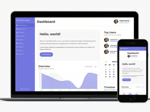
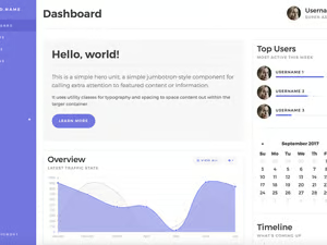
Bootstrap 4 Startup UI Kit

There are tons of beautiful full templates out there that include all the code to get started quickly and easily. Check out our Startup UI Kit. The free version includes loads of code and design.


Comments