

by Tony Thomas
June 16, 2014
Tony creates pixel-perfect UI kits & icons. His pug, Wednesday, is Medialoot's beloved mascot.
Quick Tip: How To Create CSS Text Effects Using Only The text-shadow Attribute
The text-shadow css attribute is fun and simple way to add impressive effects to your typography. Used in moderation text effects can add visual interestingness with minimal effort (you can even just copy and paste these examples!)
About The text-shadow Attribute
The text-shadow attribute is, as you may have guessed a way of adding a shadow to text. It varies from the box-shadow attribute in that it targets only typography and it also lacks support for the inset feature that can be used with box-shadows to create inner shadows, so we need to be a little more creative. The text-shadow attribute can create basic shadows but it gets much more interesting when you experiment with multiple shadows.Syntax
The basic syntax for the text-shadow attribute is:text-shadow: horizontal-offset vertical-offset blur color;So for example a basic drop shadow at 90 degrees would be:
text-shadow: 0px 3px 5px #000;To add multiple shadows, a comma is used to separate each shadow. For example a crude bevel/emboss effect would be:
text-shadow: 0px 3px 5px #000, 0px -3px 5px #fff;The color value can be either a hex value or rgb/rgba. rgba in particular is ideal for shadows because it has the alpha value which sets the transparency of a color. An example using rgba:
text-shadow: 0px 3px 5px rgba(20,20,20,0.5);
Example 1: Emboss Effect
 HTML:
HTML:
<p class="emboss">Emboss</p>CSS:
body {
  background-color: #dfe3e5;
  font: 700 6.25em Helvetica;
  text-align: center;
}

.emboss {
  text-shadow: 0 -4px 3px rgba(255, 255, 255, 0.3), 0 3px 4px rgba(0, 0, 0, 0.2);
  color: #d7dee1;
}
Example 2: Deboss Effect
 HTML:
HTML:
<p class="deboss">Deboss</p>CSS:
body {
  background-color: #dfe3e5;
  font: 700 6.25em Helvetica;
  text-align: center;
}

.deboss {
  text-shadow: 0 2px 3px rgba(255, 255, 255, 0.3), 0 -1px 2px rgba(0, 0, 0, 0.2);
  color: #d7dee1;
}
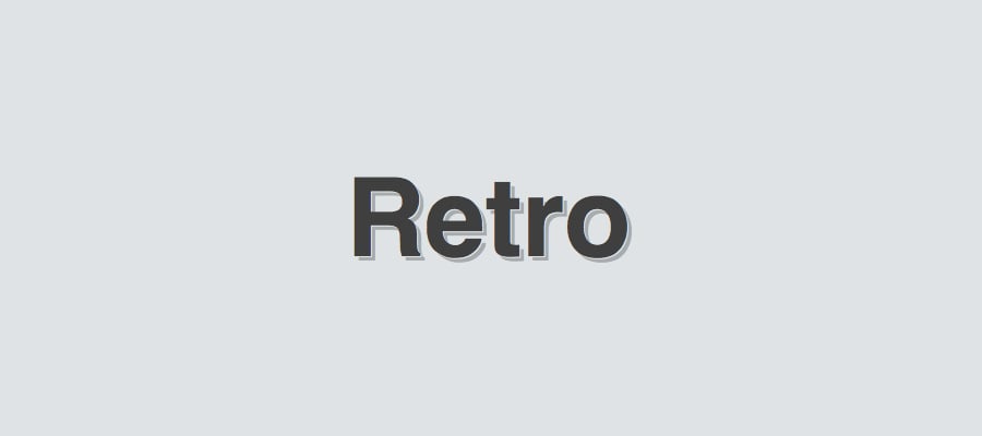
Example 3: Retro Double Shadow Effect
 HTML:
HTML:
<p class="retro">Retro</p>CSS:
body {
  background-color: #dfe3e5;
  font: 700 6.25em Helvetica;
  text-align: center;
}

.retro {
  text-shadow: 1px 1px 0 rgb(223, 227, 229), 4px 4px 0 rgba(0, 0, 0, 0.25);
  color: #3f3f3f;
}
Comments